Showing posts sorted by relevance for query delta phenomenon. Sort by date Show all posts

Friday, 27 January 2012

Testing the Delta Phenomenon

The second book I ever bought about trading was Welles Wilder's "The Delta Phenomenon," which I bought as a result of a recommendation in the first book I ever bought. Subsequently I also bought the "The Adam Theory of Markets" and a few years later I bought the "Ocean Theory" book, so one could say I own the whole trilogy!

When I bought these I was doing my charting by hand on graph paper using prices from the Wall Street Journal, but in due course I got a computer and began using various software programs; Excel, Open Office Calc, QtStalker and finally ended up where I am today using OctaveR and Gnuplot. But however proficient I became at using these last three my programming skills weren't up to coding the Delta Phenomenon, until now that is. I had already quite easily coded the Adam Projection and the Natural Market Mirror, Natural Market River and Natural Moving Average from Ocean theory. Over the next few posts I am going to outline how I intend to test the Delta Phenomenon and show the eventual results of these tests, but before that I am going to present in this post the "breakthrough" piece of coding that finally allows me to do so. I think other users of R may find it useful.

The issue to be solved was overcoming the problem of missing days in the time series data, e.g. weekends, holidays, exchange closures, just plain missing data etc. because the Delta Phenomenon is predicated on counting days before or after specified dates, and of course any algorithmic counting over the data would be upset by such missing days. My forum query here and forum searches that turned up this led me to the R xts package, which finally resulted in me being able to write the following piece of R code
rm(list=ls(all=TRUE)) # remove all previous data from workspace
library(xts) # load the required library

# preparation for output to new file
sink(file="solution",append=FALSE,type=c("output"),split=FALSE)

# read in the raw data files
data_1 <- read.csv(file="sp",header=FALSE,sep=",")
itdmtd <- read.csv(file="itdmtd",header=FALSE,sep=",")

# create xts objects from above data:
x <- xts(data_1[c('V2','V3','V4','V5')],as.Date(data_1[,'V1']))
y <- xts(itdmtd[c('V2','V3','V4','V5','V6','V7','V8','V9')],as.Date(itdmtd[,'V1']))
z <- merge.xts(x,y) # merge x and y

# create a contiguous date vector to encompass date range of above data
d <- timeBasedSeq(paste(start(z),end(z),"d",sep="/"), retclass="Date")

# merge z with an "empty" xts object, xts(,d), filling with NA
prices <- merge(z,xts(,d),fill=NA)

# coerce prices xts object to a data frame object
prices_df <- data.frame(date=index(prices), coredata(prices))

# output to new file
write.table(prices_df,quote=FALSE,row.names=FALSE,col.names=FALSE,sep=",")
sink()
The code takes a csv file of the price time series, merges it with a csv file of the "Delta Solution," fills in any missing dates and then writes out the result to a final csv file that looks like this

1995-01-03,828.55,829.45,827.55,828.8,NA,NA,NA,NA,NA,NA,NA,NA
1995-01-04,830.2,831.25,827.6,831.1,NA,NA,NA,NA,NA,NA,NA,NA
1995-01-05,830.5,831.45,829.85,830.6,NA,NA,NA,NA,NA,NA,NA,NA
1995-01-06,830.75,833.05,829,830.35,NA,NA,NA,NA,NA,NA,NA,NA
1995-01-07,NA,NA,NA,NA,NA,NA,NA,NA,NA,NA,NA,NA
1995-01-08,NA,NA,NA,NA,NA,NA,NA,NA,NA,NA,NA,NA

This might not actually look like much, but using this as input to this Gnuplot script
reset
set title "Medium Term Delta Turning Points" textcolor rgb "#FFFFFF"
set object 1 rect from graph 0, 0, 0 to graph 1.1, 1.1, 0 behind lw 1.0 fc rgb "#000000" fillstyle solid 1.00
set datafile separator ","
set xdata time
set timefmt "%Y-%m-%d"
set format x
set y2range [0:1]

plot "solution" using 1:10 notitle with impulses linecolor rgb "#B0171F" axis x1y2, \
"solution" using 1:11 notitle with impulses linecolor rgb "#0000FF" axis x1y2, \
"solution" using 1:12 notitle with impulses linecolor rgb "#FFA500" axis x1y2, \
"solution" using 1:13 notitle with impulses linecolor rgb "#00EE00" axis x1y2, \
"solution" using 1:2:3:4:5 notitle with candlesticks linecolor rgb "#FFFFFF" axis x1y1, \
"solution" using 1:($$2>$$5?$$2:1/0):($$2>$$5?$$3:1/0):($$2>$$5?$$4:1/0):($$2>$$5?$$5:1/0) notitle with candlesticks lt 1 axis x1y1, \
"solution" using 1:($$2<$$5?$$2:1/0):($$2<$$5?$$3:1/0):($$2<$$5?$$4:1/0):($$2<$$5?$$5:1/0) notitle with candlesticks lt 3 axis x1y1
gives a nice plot thus

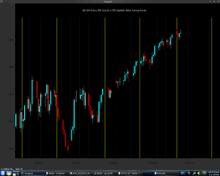
Many readers might say "So what! And...?" but to those readers who know what the Delta Phenomenon is, the coloured lines will be significant. Furthermore, using free, open source software I have created a free, as in gratis, alternative to the software that the Delta Society sells on its website. Most importantly of all, of course, is that I am now in a position to do computerised testing of the Delta Phenomenon. More on these tests in upcoming posts.

Monday, 30 January 2012

Testing the Delta Phenomenon, Part 3

Readers may recall from my recent post that the "problem" with the Delta Phenomenon is that it is very subjective and therefore difficult to test objectively. This post will outline how I intend to conduct such an objective test, using R, and discuss some issues related to the test.

Firstly, I am going to use the statistical concept of Cross-validation, whereby a model is trained on one set of data and tested for accuracy on another set of data, which is actually quite common in the world of back testing. Since the "Delta solutions" I will be testing come from late 2006 (See Testing the Delta Phenomenon, Part 2) the 4 years from 2008 to 2011 inclusive can be considered to be the validation set for this test. The test(s) will assess the accuracy of the predicted highs and lows for this period, on each Delta time frame for which I have solutions, by counting the difference in days between actual highs and lows in the data and their predicted occurrences and then creating an average error for these differences. This will be the test statistic. Using R, a Null Hypothesis average error distribution for random predictions on the same data will be created, using the same number of predicted turning points as per the Delta solution being tested. The actual average error test statistic on real data will be compared with this Null Hypothesis distribution of the average error test statistic and the Null Hypothesis rejected or not, as the case may be. The Null Hypothesis may be stated as
  • given a postulated number of turning points the accuracy of the Delta Phenomenon in correctly predicting when these turning points will occur, using the average error test statistic described above as the measure of accuracy, is no better than random guessing as to where the turning points will occur.
whilst the Alternative Hypothesis may be stated as
  • given a postulated number of turning points the accuracy of the Delta Phenomenon in correctly predicting when these turning points will occur, using the average error test statistic described above as the measure of accuracy, is better than could be expected from random guessing as to where the turning points will occur.
and therefore, by extension, we can accept that Delta has some (unquantifiable) predictive accuracy. For Delta to pass this test we want to be able to reject the Null Hypothesis.

All of this might be made clearer for readers by following the commented R code below.
# Assume a 365 trading day year, with 4 Delta turning points in this year
# First, create a Delta Turning points solution vector, the projected
# days on which the market will make a high or a low 
proj_turns <- c(47,102,187,234) # day number of projected turning points

# now assume we apply the above Delta solution to future market data
# and identify, according to the principles of Delta, the actual turning 
# points in the future unseen "real data"
real_turns <- c(42,109,193,226) # actual market turns occur on these days

# calculate the distance between the real_turns and the days on which 
# the turn was predicted to occur and calculate the test statistic 
# of interest, the avge_error_dist
avge_error_dist <- mean( abs(proj_turns - real_turns) )
print(avge_error_dist) # print for viewing

# calculate the theoretical probability of randomly picking 4 turning points
# in our 365 trading day year and getting an avge_error_dist that is equal 
# to or better than the actual avge_error_dist calculated above.
# Taking the first projected turning point at 47 and the actual turning 
# that occurs at 42, to get an error for this point that is as small as or
# smaller than that which actually occurs, we must randomly choose one of 
# the following days: 42,43,44,45,46,47,48,49,50,51 or 52. The probability of
# randomly picking one of these numbers out of 1 to 365 inclusive is
a <- 11/365
# and similarly for the other 3 turning points
b <- 15/364 # turning point 2
c <- 13/363 # turning point 3
d <- 17/362 # turning point 4
# Note that the denominator decreases by 1 each time because we are
# sampling without replacement i.e. it is not possible to pick the same
# day more than once. Combining the 4 probabilities above, we get
rdn_prob_as_good <- (a*b*c*d)/100 # expressed as a %
print( rdn_prob_as_good ) # a very small % !!!

# but rather than rely on theoretical calculations, we are actually
# going to repeated, randomly choose 4 turning points and compare their 
# accuracy with the "real accuracy", as measured by avge_error_dist

# Create our year vector to sample, consisting of 365 numbered days
year_vec <- 1:365

# predefine vector to hold results
result_vec <- numeric(100000) # because we are going to resample 100000 times

# count how many times a random selection of 4 turning points is as good
# as or better than our "real" results
as_good_as = 0

# do the random turning point guessing, resampling year_vec, in a loop
for(i in 1:100000) {
  # randomly choose 4 days from year_vec as turning points
  this_sample <- sample( year_vec , size=4 , replace=FALSE )
  
  # sort this_sample so that it is in increasing order
  sorted_sample <- sort( this_sample , decreasing=FALSE )
  
  # calculate this_sample_avge_error_dist, our test statistic
  this_sample_avge_error_dist <- mean( abs(proj_turns - sorted_sample) )
  
   # if the test statistic is as good as or better that our real result
   if( this_sample_avge_error_dist <= avge_error_dist ) {
     as_good_as = as_good_as + 1 # increment as_good_as count
   }
  
  # assign this sample result to result_vec
  result_vec[i] <- this_sample_avge_error_dist
}

# convert as_good_as to %
as_good_as_percent <- as_good_as/100000

# some summary statistics of result_vec
mean_of_result_vec <- mean( result_vec )
standard_dev_of_result_vec <- sd( result_vec )
real_result_from_mean <- ( mean_of_result_vec - avge_error_dist )/standard_dev_of_result_vec

print( as_good_as ) # print for viewing
print( as_good_as_percent ) # print for viewing
print( mean_of_result_vec ) # print for viewing
print( standard_dev_of_result_vec ) # print for viewing
print( real_result_from_mean ) # print for viewing

# plot histgram of the result_vec
hist( result_vec , freq=FALSE, col='yellow' )
abline( v=avge_error_dist , col='red' , lwd=3 )
Typical output of this code is
which shows a histogram of the distribution of random prediction average errors in yellow, with the actual average error shown in red. This is for the illustrative hypothetical values used in the code box above. Terminal prompt output for this is

[1] 6.5
[1] 2.088655e-08
[1] 38
[1] 0.00038
[1] 63.78108
[1] 32.33727
[1] 1.771364

where
6.5 is actual average error in days
2.088655e-08 is "theoretical" probability of Delta being this accurate
38 is number of times a random prediction is as good as or better than 6.5
0.00038 is 38 expressed as a percentage of random predictions made
63.78108 is the mean of the random distribution histogram
32.33727 is the standard deviation of the random distribution histogram
1.771364 is the difference between 63.78108 and 6.5 expressed as a multiple of the 32.33727 standard deviation.

This would be an example of the Null Hypothesis being rejected due to the 0.00038 % figure for random prediction accuracy being better than actual accuracy; in statistical parlance - a low p-value. Note, however, gross the difference between this figure and the "theoretical" figure. Also note that despite the Null being rejected the actual average error falls well within 2 standard deviations from the mean of the random distribution. This of course is due to the extremely heavy right-tailedness of the distribution, which expands the standard deviation range.

This second plot
and

[1] 77.75
[1] 2.088655e-08
[1] 48207
[1] 0.48207
[1] 79.85934
[1] 27.60137
[1] 0.07642148

shows what a typical failure to reject the Null Hypothesis would look like - a 0.48 p-value - and an actual average error that is indistinguishable from random, typified by it being well within a nice looking bell curve distribution.

So there it is, the procedure I intend to follow to objectively test the accuracy of the Delta Phenomenon.

Friday, 27 January 2012

Testing the Delta Phenomenon, Part 2

Towards the end of 2006 the Delta Society message board had a lot of screen shots, short screen casts and uploaded file attachments and quite a lot of discussion about them was generated. As a Delta Phenomenon book owner I had access to this, and I have to admit I was really surprised at how much information was, perhaps inadvertently, being given out. What was typically shown is exemplified by posts #81 and #86 on this forum thread. Unfortunately all that now seems to have been taken down; when I log in to the message board now all I see is two old posts from February 2007 and an "Information for all Clients" section. I remember that back in 2006 I spent hours and hours studying all this information and cross referencing it with the book. The result of all my work was that I now have what are called the Intermediate Term and Medium Term "Delta Solutions" for 30 major US commodity contracts and 6 forex pairs, including the 4 major pairs. However, after getting these solutions, for reasons outlined in my previous post, I did nothing with them and for the last 5 years my hand written notes, along with my copy of the book, have been languishing on my bookshelf.

The main "problem" with the Delta Phenomenon is that it can be very subjective. This assertion is borne out by this quote - "We have observed over time that market participants using Delta and applying it differently do not make buy & sell decisions en-masse at the same time. Also, while the Delta order is perfect, our interpretation of the order is never 100% accurate."  which is taken from the FAQ section of the above mentioned message board. Also here are some random comments that I have cut and pasted from the above linked forum thread (views expressed are those of the original forum posters, not mine)
  • ...as the delta phenomenom could be really nothing but a recurring coincidence that no one can actually use with a good accuracy rate.
  • ...while there may be something in the theory, finding a practical application for it is impossible. To make sense of it everything has to be viewed in hindsight...
  • I thought it was interesting, but just like drawing lines on a chart, I could find a turning point any sequence I decided to use. I think we humans are extraordinary at seeking out patterns in the world around us. Maybe not such a good thing though if there really is no pattern, just perception.
  • Like most any indicator, it looks great in hindsight as you can apply each turning point to the nearest high/low. Problem is, of course, you never know this in real time, only after the fact.
  • Trading with Delta is a lot like looking at an MT4 indicator that "repaints".
  • Mind you, I'm not saying the concept behind Delta is not valid. Just that because of the latitude afforded on either side of the "turning point" day, plus the idea of inversions......it's just real tough to be sure until after the fact. Even the monthly newsletter that Wilder sent out with turning point calls was often subject to correction and change.....a lot of subjectivity with this method.
  • Much is left to the trader's own subjective judgment.
I think readers of this blog will get the point! How can you objectively test something that is so subjective? I don't think merely making or losing money based on subjective interpretation of the points is a fair and objective test of the theory. I posted this forum question and the only answer so far is really good and unless something better is suggested on this forum, or occurs to me, this is the test I plan to implement. A more detailed discussion of this test will be the subject of my next post, but until then readers might be interested in doing some background reading on the matter via the links below
Resampling
Monte Carlo Methods
Bootstrapping
Statistical Hypothesis Testing

Sunday, 26 February 2012

Testing Delta, Conclusion

This post will be the last in this series that tests the Delta Phenomenon, and acts as a summary of the previous posts. Part 1 talks about the "breakthrough" R coding that made the series of tests possible, part 2 was a general discussion about the subjectiveness of Delta, part 3 introduced the methodology of my statistical tests of Delta, with R code of the test routine, parts 4 & 5 present the results of the tests on the S&P 500 MTD solution, and part 6 the results of the ITD solution. The final results in posts 4, 5 & 6 mean that the null hypothesis of no predictive ability for Delta can be rejected, and thus the alternative hypothesis of Delta having predictive ability is accepted.

One should be cautioned, however, that statistical significance is not necessarily of practical significance, and perhaps one should ask why the Delta Phenomenon should work at all? A lot of the criticism I have read on forums etc. obviously relates to the difficulty of actually using Delta in trading. Another theme of criticism relates to the supposed "astrological" aspect of Delta and therefore some rather dismissive comments relegating Delta to the realm of crystal-ball gazing, mumbo-jumbo. I think this second form of criticism is ill-founded and rather ignorant. If you think about it, the interaction of the Sun and Earth, the phases of the moon etc. are just another way of saying "seasonality" and I think it is pretty well accepted that there is seasonality in, for example, agricultural commodity futures, oil futures etc. This seasonality may well be reflected in the share prices/indices by the linkage of large commercial interests in these areas, and various knock-on effects in trade, currency movements etc. My take on Delta is that it can be regarded as a sophisticated form of seasonal analysis, and all the normal caveats that would apply to trading seasonal tendencies should also apply to Delta.

Accepting that there could be some reasonable fundamental justification for Delta and that it has been shown to be statistically significant in terms of its accuracy as described by the methodology, how does one actually trade it? Some guidelines might be gleaned from these sample reports from a Delta timing service. Reading these sample reports shows how a knowledge of Delta can be used to draw inferences from current market action and to perhaps formulate a suitable trading strategy. Of course, analysis such as this is not a 100% mechanical approach, but it may very well add real value to the bottom line.

Given this, I have decided to deploy all the other Delta solutions I have to create Delta Charts that look like this
where the solid vertical lines are the MTD solution and the dashed the ITD solution. Doing this across the 30 or so commodities I regularly track will probably take me a few weeks. Once done, I will think about how to combine Delta with the other indicators I have mentioned in previous posts and test a trading system based on them. More in due course.

Sunday, 5 February 2012

Testing the Delta Phenomenon, Part 4

The results of the first test are in! The test period approximately covers 2011, from 6th January 2011 to 12th January 2012 inclusive and the test was of the MTD Delta solution for the S&P 500. I chose the S&P 500 because I suppose that most readers would be interested in this market as a proxy for stock markets in general. There are 12 turning points in this solution and a screen shot is shown below.
The projected solution turning points are indicated with white, red and green lines whilst the actual turns in the data are indicated in yellow. For the purposes of counting, each yellow, actual turn line is paired with one of the projected solution lines, i.e. counting from the left the first yellow line is paired with the first white solution line, the second with the second, third with third etc. The red solution lines indicate the "inversion" window with the green line between them being the number 1 point of the solution.

The first thing that stands out is that the biggest move of the year occurred within the inversion time period window, and the Delta Phenomenon book states that big moves can be expected around the number 1 point (green line), so kudos to Delta so far. Another thing that stands out is that most turning points occur within one to two weeks of their projected turning points, well within the margin of error for this solution. Kudos plus 2 for Delta. However the litmus test is this
[1] 8.769231
[1] 278
[1] 0.0556
[1] 33.09061
[1] 14.54137
[1] 1.672565
the results of a 0.5 million random permutation test. With only 278 random permutations out of half a million matching or bettering the average error test statistic, giving a p-value of 0.0556%, the null hypothesis can be rejected at a statistical significance level of 0.1%. Delta has passed this first test.

Wednesday, 2 October 2013

Review of Quantpedia.com

I was recently contacted and asked if I wouldn't mind writing a short review of the Quantpedia website in return for complimentary access to that site's premium section, and I am happy to do so. Readers can get a flavour of the website by perusing the free content that is available in the Screener tab and reading the Home, About and How We Do It tabs. Since these are readily accessible by any visitor to the site, this review will concentrate purely on the content available in the premium section.

The thing that strikes me is the wide and eclectic range of studies available, which can be easily seen by clicking on the keywords dropdown box on the screener tab. There is something for almost all trading styles and I would be surprised if a visitor to the premium section found nothing of value. As always the devil is in the details, and of course I haven't read anywhere near all the information that is available in the various studies, but a brief visual overview of the various studies' performance taken from Quantpedia's screener page is provided in the scatterchart below:
(n.b. Those studies that lie exactly on the y-axis (volatility = 0%) do not have no volatility, but no % figure for volatility was given in the screener.)

As can be seen there are some impressive performers, which are fully disclosed in the premium section. A few studies, irrespective of performance, did catch my immediate attention. Firstly, there are a couple of studies that look at lunar effects in stock markets and precious metals. Long time readers of this blog will know that some time back I did a series of tests on the Delta Phenomenon, which is basically a lunar effect model of price turning points. The conclusion of the tests I conducted was that the Delta Phenomenon did have statistically significant predictive ability. The above mentioned studies come to the same conclusion with regard to lunar effects, although via a different testing methodology. It is comforting to have one's own research conclusions confirmed by independent researchers, and it's a valuable resource to be able to see how other researchers approach the testing of similar market hypotheses.

Secondly, there is a study on using Principal Components Analysis to characterise the current state of the market. This is very much in tune with what I'm working on at the moment with my neural net market classifier, and the idea of using PCA as an input is a new one to me and one that I shall almost certainly look into in more detail.

This second point I think neatly sums up the main value of the studies on the Quantpedia site - they can give you new insights as to how one might develop one's own trading system(s), with the added benefit that the idea is not a dead end because it has already been tested by the original paper's authors and the Quantpedia site people. You could also theoretically just take one of the studies as a stand alone system and tweak it to suit your own needs, or add it as a form of diversification to an existing set of trading systems. Given the wide range of studies available, this would be a much more robust form of diversification than merely adjusting a look back length, parameter value or some other such cosmetic adjustment.

In conclusion, since I can appreciate the value in the Quantpedia site, I would like to thank Martin Nizny of Quantpedia for extending me the opportunity to review the premium section of the site.

Sunday, 19 February 2012

Testing the Delta Phenomenon, Part 6

I have now finished the testing of the Intermediate Term solution for the S&P 500 and summary results are shown below, giving the test period for each separate test conducted (15 in total) along with the test statistic of the actual data and the p-value percentage, which should be read as the percentage of random permutations (500,000 in total for each test) that were as good as or better than the actual test statistic in question for that period. The period for each test covers the time span for one complete cycle of the solution, i.e. from point 1 to point 12 of the solution. The entire test period more or less corresponds with the period for the earlier Medium Term solution tests, and as in those previous tests, the data for the period is out of sample data, i.e. not "seen" by the solution prior to the tests being conducted.

5th March 2007 (4445) to 25th June 2007 (4557)
[1] 3.5
[1] 0.3668 %

3rd July 2007 (4565) to 22nd Oct 2007 (4676)
[1] 4.75
[1] 3.3826 %

30th Oct 2007 (4684) to 17th Feb 2008 (4794)
[1] 4.583333
[1] 2.8366 %

25th Feb 2008 (4802) to 14th June 2008 (4912)
[1] 3.916667
[1] 0.9496 %

17th June 2008 (4915) to 10th Oct 2008 (5030)
[1] 3.333333
[1] 0.2472 %

18th Oct 2008 (5038) to 5th Feb 2008 (5148)
[1] 3.333333
[1] 0.2524 %

9th Feb 2009 (5152) to 4th June 2009 (5267)
[1] 5.083333
[1] 4.7866 %

5th June 2009 (5268) to 2nd Oct 2009 (5387)
[1] 5.333333
[1] 5.477 %

9th Oct 2009 (5394) to 29th Jan 2010 (5506)
[1] 4.25
[1] 1.9232 %

2nd Feb 2010 (5510) to 4th June 2010 (5632)
[1] 4.230769
[1] 1.306 %

31st May 2010 (5628) to 21st Sept 2010 (5741)
[1] 3.583333
[1] 0.4506 %

23rd Sept 2010 (5743) to 28th Jan 2011 (5870)
[1] 3.538462
[1] 0.2902 %

31st Jan 2011 (5873) to 21st May 2011 (5983)
[1] 4.083333
[1] 1.5542 %

31st May 2011 (5993) to 8th Sept 2011 (6093)
[1] 4.272727
[1] 3.2184 %

16th Sept 2011 (6101) to 2nd Feb 2012 (6240)
[1] 3.928571
[1] 0.2982 %

As can be seen, if 5 % is taken as the level of statistical significance only one test fails to reject the null hypothesis, and 7 out of the remaining 14 are statistically significant at the 1 % level. I also repeated the test several times over the entire data period, encompassing a total of 182 separate turning points with a test statistic of 4.10989 for these 182 points. In these repeated tests (for a total of a few million permutations) not a single permutation was as good as or better than the given test statistic! These results are much better than I had anticipated and I therefore consider Delta to have passed these tests as well. For readers' interest a plot of the period in which the null hypothesis is not rejected is shown below,

where the yellow lines are my identification of the actual turning points and the white, red and green lines are the turning points projected by the solution.

Now that this series of tests is complete, and Delta has passed them, what does it all mean? This will be the subject of my next post.

Wednesday, 15 February 2012

Delta Training Starts Tomorrow!

As a comment to my earlier post "Anonymous" left this information

...there is a Delta Phenomenon multi-week training session via IRC by a group of DP experts!.. The classes are Monday, Wednesday and Friday 2-5pm EST starting on February 16th. irc server irc.forex.com #training

I shall try to attend these training sessions, and look forward to them. 

Tuesday, 24 November 2020

Temporal Clustering on Real Prices

Having now had time to run the code shown in my previous post, Temporal Clustering, part 3, in this post I want to show the results on real prices.

Firstly, I have written two functions in Octave to identify market turning points and each function takes as input an n_bar argument which determines the lookback/lookforward length along price series to determine local relative highs and lows. I ran both these for n_bar values of 1 to 15 inclusive on EUR_USD forex 10 minute bars from July 2012 upto and including last week's set of 10 minute bars. I created 3 sets of turning point data per function by averaging the function outputs over n_bar 1 - 15, 1 - 6 and 7 - 15, and also averaged the outputs over the average of the 2 functions over the same ranges. In total this gives 9 slightly different sets of turning point data.

I then ran the optimal K clustering code, shown in previous posts, over each set of data to get the "solutions" per set of data. Six of the sets had an optimal K value of 8 and a combined plot of these is shown below.

For each "solution" turning point ix (ix ranges from 1 to 198) a turning point value of 1 is added to get a sort of spike train plot through time. The ix = 1 value is 22:00 BST on Sunday and ix = 198 is 06:50 BST on Tuesday. I chose this range so that there would be a buffer at each end of the time range I am really interested in: 7:00 BST to 22:00 BST, which covers the time from the London open to the New York close. The vertical blue lines are plotted for clarity to help identify the the turns and are plotted as 3 consecutive lines 10 minutes apart. The added text shows the time of occurence of the first bar of each triplet of lines, the time being London BST. The following second plot is the same as above but with the other 3 "solutions" of K = 5, 10 and 11 added.
For those readers who are familiar with the Delta Phenomenon the main vertical blue lines could conceptually be thought of as MTD lines with the other lines being lower timeframe ITD lines, but on an intraday scale. However, it is important to bear in mind that this is NOT a Delta solution and therefore rules about numbering, alternating highs and lows and inversions etc. do not apply. It is more helpful to think in terms of probability and see the various spikes/lines as indicating times of the day at which there is a higher probability of price making a local high or low. The size of a move after such a high or low is not indicated, and the timings are only approximate or alternatively represent the centre of a window in which the high or low might occur.

The proof of the pudding is in the eating, however, and the following plots are yesterday's (23 November 2020) out of sample EUR_USD forex pair price action with the lines of the above "solution" overlaid. The first plot is just the K = 8 solution plot

whilst this second plot has all lines shown.
Given the above caveats about caution with regards to the lines only being probabilities, it seems uncanny how accurately the major highs and lows of the day are picked out. I only wish I had done this analysis sooner as then yesterday could have been one of my best trading days ever!

More soon.

Monday, 13 February 2012

Testing the Delta Phenomenon, Part 5

The first round of tests, consisting of tests of the Medium Term Solution for the S & P 500, is now complete and the summary results are given below.

Years 2007 to 2008 - 16th Aug 2007 to 6th Jan 2009 incl.
[1] 9.722222 - test statistic, the average error of identified turns, in days
[1] 103 - number of random permutations as good as or better than test stat
[1] 0.0206 - above expressed as % of permutations, the p-value
[1] 37.6425 - average of permutation error distribution, in days
[1] 16.32295 - standard deviation of permutation error distribution, in days
[1] 1.710493 - test statistic distance from average of permutation error distribution, expressed as a multiple of standard deviation of permutation error distribution

Year 2009 - 20th Dec 2008 to 16th Jan 2010 incl.
[1] 10.42857 - test statistic, the average error of identified turns, in days
[1] 809 - number of random permutations as good as or better than test stat
[1] 0.1618 - above expressed as % of permutations, the p-value
[1] 33.43553 - average of permutation error distribution, in days
[1] 14.18181 - standard deviation of permutation error distribution, in days
[1] 1.622286 - test statistic distance from average of permutation error distribution, expressed as a multiple of standard deviation of permutation error distribution

Year 2010 - 27th Nov 2009 to 28th Jan 2011 incl.
[1] 11.35714 - test statistic, the average error of identified turns, in days
[1] 1706 - number of random permutations as good as or better than test stat
[1] 0.3412 - above expressed as % of permutations, the p-value
[1] 34.92687 - average of permutation error distribution, in days
[1] 15.36711 - standard deviation of permutation error distribution, in days
[1] 1.533777 - test statistic distance from average of permutation error distribution, expressed as a multiple of standard deviation of permutation error distribution

All out of sample data - 16th Aug 2007 to 28th Jan 2012
[1] 9.8 - test statistic, the average error of identified turns, in days
[1] 0 - number of random permutations as good as or better than test stat
[1] 0 - above expressed as % of permutations, the p-value
[1] 67.47298 - average of permutation error distribution, in days
[1] 29.38267 - standard deviation of permutation error distribution, in days
[1] 1.962823 - test statistic distance from average of permutation error distribution, expressed as a multiple of standard deviation of permutation error distribution

The histogram plot of the final, all out of sample data
I think the results are unambiguous - given the consistently low p-values the null hypothesis can be rejected and the alternative hypothesis accepted i.e. the S & P 500 Medium term solution is NOT random and therefore has some predictive value.

My next round of tests will be of the Intermediate term solution for the S & P 500. Before conducting these tests however, I would like to state my expectation that the results will not be as conclusive as those given above. This is due to the fact that the Intermediate term solution also has 12 points, but these 12 points occur within a time period that is approximately 120 days long, so the actual average error on this time frame will have to be 2 or 3 bars/days or better to match the above results.

Tuesday, 20 October 2020

A Temporal Clustering Function

Recently a reader contacted me with a view to collaborating on some work regarding the Delta phenomenon but after a brief exchange of e-mails this seems to have petered out. However, for my part, the work I have done has opened a few new avenues of investigation and this post is about one of them.

One of the problems I set out to solve was clustering in the time domain, or temporal clustering as I call it. Take a time series and record the time of occurance of an event by setting to 1, in an otherwise zero filled 1-dimensional vector the same length as the original time series, the value of the vector at time index tx and repeat for all occurances of the event. In my case the event(s) I am interested in are local highs and lows in the time series. This vector is then "chopped" into segments representing distinct periods of time, e.g. 1 day, 1 week etc. and stacked into a matrix where each row is one complete period and the columns represent the same time in each period, e.g. the first column is the first hour of the trading week, the second column the second hour etc. Sum down the columns to get a final 1-dimensional vector of counts of the timing of events happening within each period over the entire time series data record. A chart of such is shown below.

The coloured vertical lines show the opening and closing times of the London and New York sessions (7am to 5pm in their respective local times) for one complete week at a 10 minute bar time scale, in this case for the GBP_USD forex pair. This is what I want to cluster.

The solution I have come up with is the Octave function in the code box below

## Copyright (C) 2020 dekalog
## 
## This program is free software: you can redistribute it and/or modify it
## under the terms of the GNU General Public License as published by
## the Free Software Foundation, either version 3 of the License, or
## (at your option) any later version.
## 
## This program is distributed in the hope that it will be useful, but
## WITHOUT ANY WARRANTY; without even the implied warranty of
## MERCHANTABILITY or FITNESS FOR A PARTICULAR PURPOSE.  See the
## GNU General Public License for more details.
## 
## You should have received a copy of the GNU General Public License
## along with this program.  If not, see
## .

## -*- texinfo -*- 
## @deftypefn {} {@var{centre_ix} =} blurred_maxshift_1d_linear (@var{train_vec}, @var{bandwidth})
##
## Clusters the 1 dimensional vector TRAIN_VEC using a "centred" sliding window of length  2 * BANDWIDTH + 1.
##
## Based on the idea of the Blurred Meanshift Algorithm.
##
## The "centre ix" value of the odd length sliding window is assigned to the
## maximum value ix of the sliding window. The centre_ix, if it is not the 
## maximum value, is then set to zero. A pass through the whole length of
## TRAIN_VEC is completed before any assignments are made.
##
## @seealso{}
## @end deftypefn

## Author: dekalog 
## Created: 2020-10-17

function new_train_vec = blurred_maxshift_1d_linear ( train_vec , bandwidth )

if ( nargin < 2 )
 bandwidth = 1 ;
endif

if ( numel( train_vec ) < 2 * bandwidth + 1 )
 error( 'Bandwidth too wide for length of train_vec.' ) ;
endif

length_train_vec = numel( train_vec ) ;
assigned_cluster_centre_ix = zeros( size( train_vec ) ) ;

## initialise the while condition variable
has_converged = 0 ;

while ( has_converged < 1 )
 
new_train_vec = zeros( size( train_vec ) ) ;

## do the beginning and end of train_vec first
[ ~ , ix ] = max( train_vec( 1 : 2 * bandwidth + 1 ) ) ;
new_train_vec( ix ) = sum( train_vec( 1 : bandwidth ) ) ;

[ ~ , ix ] = max( train_vec( end - 2 * bandwidth : end ) ) ;
new_train_vec( end - 2 * bandwidth - 1 + ix ) = sum( train_vec( end - bandwidth + 1 : end ) ) ;

for ii = 2 * bandwidth + 1 : numel( train_vec ) - bandwidth
 [ ~ , ix ] = max( train_vec( ii - bandwidth : ii + bandwidth ) ) ;
 new_train_vec( ii - bandwidth  - 1 + ix ) += train_vec( ii ) ; 
endfor

if ( sum( ( train_vec == new_train_vec ) ) == length_train_vec )
 has_converged = 1 ;
else
 train_vec = new_train_vec ;
endif

endwhile

endfunction

I have named the function "blurred_maxshift_1d_linear" as it is inspired by the "blurred" version of the Mean shift algorithm, operates on a 1-dimensional vector and is "linear" in that there is no periodic wrapping of the data within the function code. The two function inputs are the above type of data, obviously, and an integer parameter "bandwidth" which controls the size of a moving window over the data in which the data is shifted according to a maximum value, hence maxshift rather than meanshift. I won't discuss the code further as it is pretty straightforward.

A chart of a typical clustering solution is (bandwidth setting == 2)

where the black line is the original count data and red the clustering solution. The bandwidth setting in this case is approximately equivalent to clustering with a 50 minute moving window. 

The following heatmap chart is a stacked version of the above where the bandwidth parameter is varied from 1 to 10 inclusive upwards, with the original data being at the lowest level per pane.

The intensity reflects the counts at each time tx index per bandwidth setting. The difference between the panes is that in the upper pane the raw data is the function input per bandwidth setting, whilst the lower pane shows hierarchical clustering whereby the output of the function is used as the input to the next function call with the next higher bandwidth parameter setting.

More in due course.