Showing posts with label PositionBook. Show all posts

Friday, 27 September 2024

Discontinuation of Oanda's OrderBook and PositionBook Endpoints via the V20 Framework

Longtime readers of this blog are almost certainly aware that over the last few years I have posted several times about Oanda's OrderBook and PositionBook data and what can be done with it. My first post was back in February 2022 where I posited the idea of using this data as a sentiment indicator, whilst my most recent post, March 2024, talked about substituting the data into standard, volume based indicators. In between these two dates I blogged about using the data as features for machine learning (here and here), different methods of plotting it (here with example trade and here) and an improved, associated optimisation method here.

Researching and posting about this has been interesting and I was quietly confident that there was some real value to be found doing this. However, I have recently been unpleasantly surprised and disappointed to learn (by way of my API cronjob downloading routines suddenly failing) that Oanda has decided to no longer make available the ability to download this data via their V20 API Framework. So, at a stroke, all of the above work has suddenly become redundant and effectively useless for back testing purposes or for future trading purposes. 

Did I say I was disappointed? Well, that understates it somewhat! I have written to Oanda to express my displeasure at this recent change and perhaps, fingers crossed, they will reinstate this V20 functionality.

Thursday, 21 March 2024

Standard "Volume based" Indicators Replaced with PositionBook Data

In my previous post I suggested three different approaches to using PositionBook data other than directly using this data to create new, unique indicators. This post is about the first of the aforementioned ideas: modifying existing indicators that somehow incorporate volume in their construction.

The indicators I've chosen to look at are the Accumulation and Distribution index, On Balance Volume, Money Flow index, Price Volume Trend and, for comparative purposes, an indicator similar to these utilising PositionBook data. For illustrative purposes these indicators have been calculated on this OHLC data,

which shows a 20 minute bar chart of the EUR_USD forex pair. The chart starts at the New York close of 4 January 2024 and ends at the New York close on 5 January 2024. The green vertical lines span 7am to 9am London time and the red lines are 7am to 9am New York time. This second chart shows the indicators individually max-min scaled from zero to one so that they can be more easily visually compared.

 
As in the OHLC chart, the vertical lines are the London and New York opening sessions. The four "traditional" indicators more or less tell the same story, which is not surprising since their calculations involve bar to bar price changes or open to close intra-bar changes which are then multiplied by bar volume. Effectively they are all just differently scaled versions of the underlying price movement, or alternatively, just accumulated sums of different fractions of the bar volume. The PositionBook data version, called Pos Change Ind, does not use any OHLC information at all but rather uses the accumulated difference(s) between position changes multiplied by volume. For most of the day the general story told by the Pos Change Ind indicator agrees with the other indicators; however during the big run up which started just about 9am New York time there is a significant difference between Pos Change Ind and the others.

In hindsight, by looking at my order levels chart

and volume profile chart
 
it is easy to speculate about what market participants were thinking during this trading day, especially if the following PositionBook chart is taken into account.
 
For the purpose of the following brief "stream of consciousness" narrative imagine it's 7am New York time and looking back at the day's action so far it can be seen that the downward drift of the day seems to have halted with a mini double bottom, and we are now moving up with some new heavy tick volumes having accumulated over the last hour or so, forming a new volume profile point of control (POC). Over the next hour prices continue the new slight drift up with accumulating long positions and at about 8.30am we see a doji bar form on the 10 minute chart at the level of the rolling vwap for the day. Suddenly there is the big down bar, which could conceivably be a shake-out of the recently added longs, targeting the stop orders below, which finishes with an extended lower wick. This seems to be an ideal set-up for a long trade targeting either the old POC, which also happens to be the current high of the day, or the accumulated orders which happen to coincide with the level at which, currently, the greatest proportion of long positions have been entered. 
 
Of course it can seen, in hindsight, that this was a great set-up for an intra-day trade that could have caught almost the entire high-low range of the day as a profitable trade, dependent of course on exact entry and exit levels. This set-up is a synthesis of observations from the volume profile chart, the order levels chart and the position levels chart, along with the vwap indicator. The Pos Change Ind indicator does not seem to add much value over that provided by the more traditional, volume based indicators in the set-up phase.

This is not necessarily the case for the exit. It can be seen that the Pos Change Ind indicator turns down sharply several bars before all the other indicators, and this movement in the indicator is evident by the close of the bar with the long upper wick which makes the high of the day. This sharp downturn in the indicator shows that there was a mass exit of longs during the formation of this bar, made clearer by the following chart which shows the two components of the Pos Change Indicator, namely the
 
"Outside Change" and the "Inside Change." The outside change shows the total net position changes for the price levels that lie outside the range of the bar and the inside change is the net change for price levels that lie within the bar range. The greater change of the two is obviously the (red) inside change, and looking at the position levels plot we can see why. The previously mentioned level of "greatest proportion of long positions" suddenly loses that distinction - a large number of the longs at this level obviously liquidated their positions. This is important information, which shows that sentiment favouring long positions obviously changed, and it can be surmised that many long position holders were happy to get out of their trade at more or less break even prices. Also noticeable in the position levels chart is the change in blue shade from darker to lighter at the price levels within the range of the large price run-up. This reduction in colour intensity shows that those traders who entered during the run-up also exited near the top of the move. Taken together these observations could have been used as a nice short set-up targeting, for example, the then currently lower level of vwap, which in fact was subsequently hit with the day closing at this level.

As I had previously suspected, there is value in PositionBook data but it is perhaps tricky to operationalise or to easily automate within a trading system. It can be used to indicate a directional bias, or as above to show when traders exit positions. Again, as shown above, it can be used to put a new, useful twist on existing indicators, but in general it appears that use of this data is primarily visual by way of my PositionBook chart and subsequent, subjective evaluation. Whilst I am pleased with the potential insights provided, I would prefer a more structured, algorithmic use of this data, as in the third point of my previous post.
 
More in due course.


Wednesday, 28 February 2024

Indicator(s) Derived from PositionBook Data

Since my last post I have been trying to create new indicators from PositionBook data but unfortunately I have had no luck in doing so. I have have tried differences, ratios, cumulative sums, logs and control charts to no avail and I have decided to discontinue this line of investigation because it doesn't seem to hold much promise. The only other direct uses I can think of for this data are:

I am not yet sure which of the above I will look at next, but whichever it is will be the subject of a future post.

Wednesday, 22 November 2023

Update to PositionBook Chart - Revised Optimisation Method

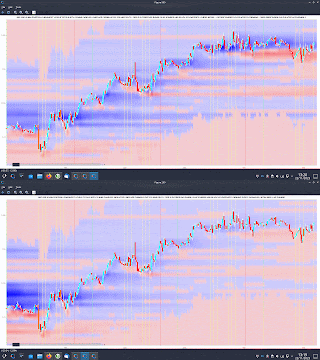
Just over a year ago I previewed a new chart type which I called a "PositionBook Chart" and gave examples in this post and this one. These first examples were based on an optimisation routine over 6 variables using Octave's fminunc function, an unconstrained minimisation routine. However, I was not 100% convinced that the model I was using for the loss/cost function was realistic, and so since the above posts I have been further testing different models to see if I could come up with a more satisfactory model and optimisation routine. The comparison between the original model and the better, newer model I have selected is indicated in the following animated GIF, which shows the last few day's action in the GBPUSD forex pair. 

The old model is figure(200), with the darker blue "blob" of positions accumulated at the lower, beginning of the chart, and the newer model, figure(900), shows accumulation throughout the uptrend. The reasons I prefer this newer model are:

  • 4 of the 6 variables mentioned above (longs above and below price bar range, and shorts above and below price bar range) are theoretically linked to each other to preserve their mutual relationships and jointly minimised over a single input to the loss/cost function, which has a bounded upper and lower limit. This means I can use Octave's fminbnd function instead of fminunc. The minimisation objective is the minimum absolute change in positions outside the price bar range, which has a real world relevance as compared to the mean squared error of the fminunc cost function.
  • because fminunc is "unconstrained" occasionally it would converge to unrealistic solutions with respect to position changes outside the price bar range. This does not happen with the new routine.
  • once the results of fminbnd are obtained, it is possible to mathematically calculate the position changes within the price bar range exactly, without needing to resort to any optimisation routine. This gives a zero error for the change which is arguably the most important.
  • the results from the new routine seem to be more stable in that indicators I am trying to create from them are noticeably less erratic and confusing than those created from fminunc results.
  • finally, fminbnd over 1 variable is much quicker to converge than fminunc over 6 variables.
The second last mentioned point, derived indicators, will be the subject of my next post.

Friday, 18 November 2022

PositionBook Chart Example Trade

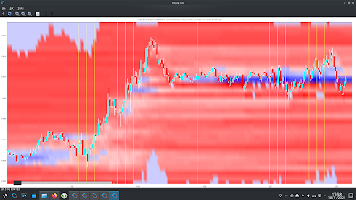
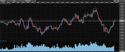
As a quick follow up to my previous post I thought I'd show an example of how one could possibly use my new PositionBook chart as a trade set-up. Below is the USD_CHF forex pair for the last two days

showing the nice run-up yesterday and then the narrow range of Friday's Asian session.

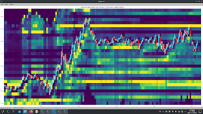
The tentative set-up idea is to look for such a narrow range and use the colour of the PositionBook chart in this range (blue for a long) to catch or anticipate a breakout. The take profit target would be the resistance suggested by the horizontal yellow bar in the open orders chart (overhead sell orders) more or less at Thursday's high.

I decided to take a really small punt on this idea but took a small loss of 0.0046 GBP
as indicated in the above Oanda trade app. I entered too soon and perhaps should have waited for confirmation (I can see a doji bar on the 5 minute chart just after my stop out) or had the conviction to re-enter the trade after this doji bar. The initial trade idea seems to have been sound as the profit target was eventually hit. This could have been a nice 4/5/6 R-multiple profitable trade.😞

Friday, 11 November 2022

A New PositionBook Chart Type

It has been almost 6 months since I last posted, due to working on a house renovation. However, I have still been thinking about/working on stuff, particularly on analysis of open position ratios. I had tried using this data as features for machine learning, but my thinking has evolved somewhat and I have reduced my ambition/expectation for this type of data.

Before I get into this I'd like to mention Trader Dale (I have no affiliation with him) as I have recently been following his volume profile set-ups, a screenshot of one being shown below.

This shows recent Wednesday action in the EUR_GBP pair on a 30 minute chart. The flexible volume profile set-up Trader Dale describes is called a Volume Accumulation Set-up which occurs immediately prior to a big break (in this case up). The whole premise of this particular set-up is that the volume accumulation area will be future support, off of which price will bounce, as shown by the "hand drawn" lines. Below is shown my version of the above chart
with a bit of extra price action included. The horizontal yellow lines show the support area.

Now here is the same data, but in what I'm calling a PositionBook chart, which uses Oanda's Position Level data downloaded via their API.

The blue (red) horizontal lines show the levels at which traders are net long (short) in terms of positions actually entered/held. The brighter the colours the greater the difference between the longs/shorts. It is obvious that the volume accumulation set-up area is showing a net accumulation of long positions and this is an indication of the direction of the anticipated breakout long before it happens. The Trader Dale set-up presumes an accumulation of longs because of the resultant breakout direction and doesn't seem to provide an opportunity to participate in the breakout itself!

The next chart shows the action of the following day and a bit where the price does indeed come back down to the "support" area but doesn't result in an immediate bounce off the support level. The following order level chart perhaps shows why there was no bounce - the relative absence of open orders at that level.

The equivalent PositionBook chart, including a bit more price action,
shows that after price fails to bounce off the support level it does recover back into it and then even more long positions are accumulated (the darker blue shade) at the support level during the London open, again allowing one to position oneself for the ensuing rise during the London morning session, followed by another long accumulation during the New York opening session for a following leg up into the London close (the last vertical red line).

This purpose of this post is not to criticise the Trader Dale set-up but rather to highlight the potential value-add of these new PositionBook charts. They seem to hold promise for indicating price direction and I intend to continue investigating/improving them in the coming weeks.

More in due course.