Friday, 25 March 2022

OrderBook and PositionBook Features

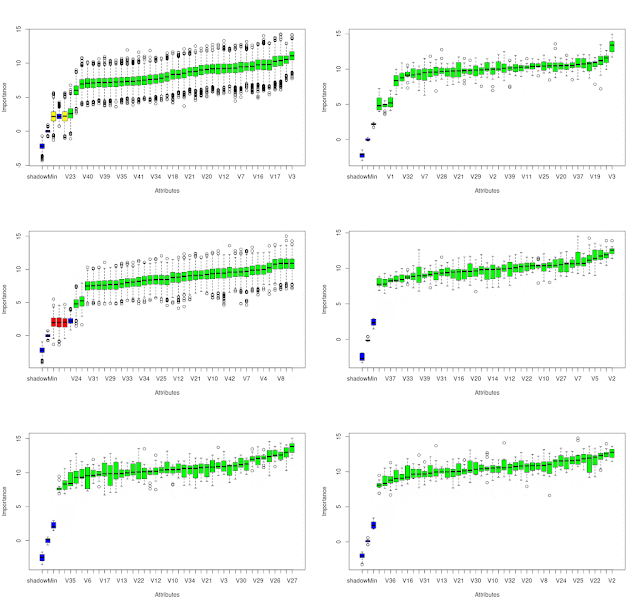
In my previous post I talked about how I planned to use constrained optimization to create features from Oanda's OrderBook and PositionBook data, which can be downloaded via their API. In addition to this I have also created a set of features based on the idea of Order Flow Imbalance (OFI), a nice exposition of which is given in this blog post along with a numerical example of how to calculate OFI. Of course Oanda's OrderBook/PositionBook data is not exactly the same as a conventional limit order book, but I thought they are similar enough to investigate using OFI on them. The result of these investigations is shown in the animated GIF below.

This shows the output from using the R Boruta package to check for the feature relevance of OFI levels to a depth of 20 of both the OrderBook and PositionBook to classify the sign of the log return of price over the periods detailed below following an OrderBook/PositionBook update (the granularity at which the OrderBook/PositionBook data can be updated is 20 minutes):

  • 20 minutes
  • 40 minutes
  • 60 minutes
  • the 20 minutes starting 20 minutes in the future
  • the 20 minutes starting 40 minutes in the future
for both the OrderBook and PositionBook, giving a total of 10 separate images/results in the above GIF.
 
Observant readers may notice that in the GIF there are 42 features being checked, but only an OFI depth of 20. The reason for this is that the data contain information about buys/sell orders and long/short positions both above and below the current price, so what I did was calculate OFI for:
  • buy orders above price vs sell orders below price
  • sell orders above price vs buy orders below price
  • long positions above price vs short positions below price
  • short positions above price vs long positions below price 
As can be seen, almost all features are deemed to be relevant with the exception of 3 OFI levels rejected (red candles) and 2 deemed tentative (yellow candles).

It is my intention to use these features in a machine learning model to classify the probability of future market direction over the time frames mentioned above. 

More in due course.

Tuesday, 15 February 2022

A Possible, New Positionbook Indicator?

In my previous post I ended with saying that I would post about some sort of "sentiment indicator" if, and only if, I had something positive to say about my progress on this work. This post is the first on this subject.

The indicator I'm working on is based on the open position ratios data that is available via the Oanda api. For the uninitiated, this data gives the percentage of traders holding long and short positions, and at what price levels, in 14 selected forex pairs and also gold and silver. The data is updated every 20 minutes. I have long felt that there must be some value hidden in this data but the problem is how to extract it.

What I've done is take the percentage values from the (usually) hundreds of separate price levels and sum and normalise them over three defined ranges - levels above/below the high/low of each 20 minute period and the level(s) that span the price range of this period. This is done separately for long and short positions to give a total of 6 percentage figures that sum to 100%. Conceptually, this can be thought of as attaching to the open and close of a 20 minute OHLC bar the 6 percentage position values that were in force at the open and close respectively. The problem is to try and infer the actual, net changes in positions that have taken place over the time period this 20 minute bar was forming. In this way I am trying, if you like, to create a sort of  "skin in the game" indicator as opposed to an indicator derived from order book data, which could be said to be based on traders' current (changeable) intentions as expressed by their open orders and which are subject to shenanigans such as spoofing.

The methodology I've decided on to realise the above is constrained optimization using Octave's fmincon function. The objective function is simply:

    denom = X' * old_pb_net_pos ;
    J = mean( ( new_pb_net_pos .- ( ( X .* old_pb_net_pos ) ./ denom ) ).^2 ) ;

for a multiplicative position value change model where:

  • X is a vector of constants that are to be optimised
  • old_pb_net_pos is a vector of the 6 percentage values at the open
  • new_pb_net_pos is a vector of the 6 percentage values at the close

This is a constrained model because percentage position values at price levels outside the bar range cannot actually increase as a result of trades that take place within the bar range, so the X values for these levels are necessarily constrained to a maximum value of 1 (implying no real, absolute change at these levels). Similarly, all X values must be greater than zero (a zero value would imply a mass exit of all positions at this level, which never actually happens).

The net result of the above is an optimised X vector consisting of multiplicative constants that are multiplied with old_pb_net_pos to achieve new_pb_net_pos according to the logic exemplified in the above objective function. It is these optimised X values from which the underlying, real changes in positions will be inferred and features created. More on this in my next post.


Tuesday, 4 January 2022

Matrix Profile and Weakly Labelled Data - 2nd and Final Update

It has been over three months since my last post, which was intended to be the first in a series of posts on the subject of the title of this post. However, it turned out that the results of my work were underwhelming and so I decided to stop flogging a dead horse and move onto other things. I still have some ideas for using Matrix Profile, but not for the above. These ideas may be the subject of a future blog post.

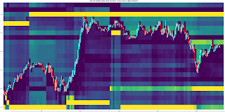
I subsequently looked at plotting order levels using the data that is available via the Oanda API and I have come up with Octave code to render plots such as this:

where the brighter yellow stripes show ranges where there is an accumulation of sell/buy orders above/below price. These can be interpreted as support/resistance areas. It is normally my practice to post my Octave code, but the code for this plot is quite idiosyncratic and depends very much on the way I have chosen to store the underlying data downloaded from Oanda. As such, I don't think it would be helpful to readers and so I am not posting the code. That said, if there is actually a demand I am more than happy to make it available in a future blog post.

Having done this, it seemed natural to extend it to Open Position Ratios which are also available via the Oanda API. Plotting these levels renders plots that are similar to the plot shown above, but show levels where open long/short positions instead of open orders are accumulated. Although such plots are visually informative, I prefer something more objective, and so for the last few weeks I have been working on using the open position ratios data to construct some sort of sentiment indicator that hopefully could give a heads up to future price movement direction. This is still very much a work in progress which I shall post about if there are noteworthy results.

More in due course.

Friday, 17 September 2021

Matrix Profile and Weakly Labelled Data - Update 1

This is the first post in a short series detailing my recent work following on from my previous post. This post will be about some problems I have had and how I partially solved them.

The main problem was simply the speed at which the code (available from the companion website) seems to run. The first stage Matrix Profile code runs in a few seconds, the second, individual evaluation stage in no more than a few minutes, but the third stage, greedy search, which uses Golden Section Search over the pattern candidates, can take many, many hours. My approach to this was simply to optimise the code to the best of my ability. My optimisations, all in the compute_f_meas.m function, are shown in the following code boxes. This while loop

i = 1;
while true
    
 if i >= length(anno_st)
    break;
 endif
       
first_part = anno_st(1:i);
second_part = anno_st(i+1:end);
bad_st = abs(second_part - anno_st(i)) < sub_len;
second_part = second_part(~bad_st);
anno_st = [first_part; second_part;];
i = i + 1;
      
endwhile
is replaced by this .oct compiled version of the same while loop
#include 
#include 

DEFUN_DLD ( stds_f_meas_while_loop_replace, args, nargout,
"-*- texinfo -*-\n\
@deftypefn {Function File} {} stds_f_meas_while_loop_replace (@var{input_vector,sublen})\n\
This function takes an input vector and a scalar sublen\n\
length. The function sets to zero those elements in the\n\
input vector that are closer to the preceeding value than\n\
sublen. This function replaces a time consuming .m while loop\n\
in the stds compute_f_meas.m function.\n\
@end deftypefn" )

{
octave_value_list retval_list ;
int nargin = args.length () ;

// check the input arguments
if ( nargin != 2 ) // there must be a vector and a scalar sublen
   {
   error ("Invalid arguments. Inputs are a column vector and a scalar value sublen.") ;
   return retval_list ;
   }

if ( args(0).length () < 2 )
   {
   error ("Invalid 1st argument length. Input is a column vector of length > 1.") ;
   return retval_list ;
   }
   
if ( args(1).length () > 1 )
   {
   error ("Invalid 2nd argument length. Input is a scalar value for sublen.") ;
   return retval_list ;
   }
// end of input checking  
  
ColumnVector input = args(0).column_vector_value () ;
double sublen = args(1).double_value () ;
double last_iter ;

// initialise last_iter value
last_iter = input( 0 ) ;
     
for ( octave_idx_type ii ( 1 ) ; ii < args(0).length () ; ii++ )
    {
    
      if ( input( ii ) - last_iter >= sublen )
      {
        last_iter = input( ii ) ;
      }
      else
      {
        input( ii ) = 0.0 ;
      }
      
    } // end for loop
   
retval_list( 0 ) = input ;

return retval_list ;

} // end of function
and called thus
anno_st = stds_f_meas_while_loop_replace( anno_st , sub_len ) ;
anno_st( anno_st == 0 ) = [] ;
This for loop
is_tp = false(length(anno_st), 1);
for i = 1:length(anno_st)
    if anno_ed(i) > length(label)
        anno_ed(i) = length(label);
    end
    if sum(label(anno_st(i):anno_ed(i))) > 0.8*sub_len
        is_tp(i) = true;
    end
end
tp_pre = sum(is_tp);
is replaced by use of cellslices.m and cellfun.m thus
label_length = length( label ) ;
anno_ed( anno_ed > label_length ) = label_length ;
cell_slices = cellslices( label , anno_st , anno_ed ) ;
cell_sums = cellfun( @sum , cell_slices ) ;
tp_pre = sum( cell_sums > 0.8 * sub_len ) ;
and a further for loop
is_tp = false(length(pos_st), 1);
for i = 1:length(pos_st)
    if sum(anno(pos_st(i):pos_ed(i))) > 0.8*sub_len
        is_tp(i) = true;
    end
end
tp_rec = sum(is_tp);
is replaced by
cell_slices = cellslices( anno , pos_st , pos_ed ) ;
cell_sums = cellfun( @sum , cell_slices ) ;
tp_rec = sum( cell_sums > 0.8 * sub_len ) ;

Although the above measurably improves running times, overall the code of the third stage is still sluggish. I have found that the best way to deal with this, on the advice of the original paper's author, is to limit the number of patterns to search for, the "pat_max" variable, to the minimum possible to achieve a satisfactory result. What I mean by this is that if  pat_max = 5 and the result returned also has 5 identified patterns, incrementally increase pat_max until such time that the number of identified patterns is less than pat_max. This does, by necessity, mean running the whole routine a few times, but it is still quicker this way than drastically over estimating pat_max, i.e. choosing a value of say 50 to finally identify maybe only 5/6 patterns.

More in due course.
Saturday, 4 September 2021

"Matrix profile: Using Weakly Labeled Time Series to Predict Outcomes" Paper

Back in May of this year I posted about how I had intended to use Matrix Profile (MP) to somehow cluster the "initial balance" of Market Profile charts with a view to getting a heads up on immediately following price action. Since then, my thinking has evolved due to my learning about the paper "Matrix profile: Using Weakly Labeled Time Series to Predict Outcomes" and its companion website. This very much seems to accomplish the same end I had envisaged with my clustering of initial balances, so I am going to try and use this approach instead.

As a preliminary, I have decided to "weakly label" my time series data using the simple code loop shown below.

for ii = 1 : numel( ix )
  
y_values = train_data( ix( ii ) + 1 : ix( ii ) + 19 , 1 ) ;
london_session_ret = y_values( end ) - y_values( 1 ) ;

[ max_y , max_ix ] = max( y_values ) ;
max_long_ex = max_y - y_values( 1 ) ;

[ min_y , min_ix ] = min( y_values ) ;
max_short_ex = min_y - y_values( 1 ) ;

if ( london_session_ret > 0 && ( max_long_ex / ( -1 * max_short_ex ) ) >= 3 && max_ix > min_ix )
 labels( ix( ii ) - 11 : ix( ii ) , 1 ) = 1 ; 
elseif ( london_session_ret < 0 && ( max_short_ex / max_long_ex ) <= -3 && max_ix < min_ix )
  labels( ix( ii ) - 11 : ix( ii ) , 1 ) = -1 ;
endif
 
endfor
What this essentially does (for the long side) is ensure that price is higher at the end of y_values than at the beginning and there is a reward/risk opportunity of at least 3:1 for at least 1 trade during the period covered by the time range of y_values (either the London a.m. session or the combined New York a.m./London p.m. session) following a 7a.m. to 8.50a.m. (local time) formation of an opening Market profile/initial balance and the maximum adverse excursion occurs before the maximum favourable excursion. A typical chart on the long side looks like this.
This would have the "weak" label for a long trade, and the label would be applied to the Market Profile data that immediately precedes this price action. On the other side, a short labelled chart typically looks like this.
As can be seen, trading "against the label" offers few opportunities for profitable entries/exits. My hope is that a "dictionary" of long/short biased Market Profile patterns can be discovered using the ideas/code in the links above. For completeness, the following chart is typical of price action which does not meet the looped code bias for either long or short.

It is easy to envisage trading this type of price action by fading moves that go outside the "value area" of a Market Profile chart.

More in due course.


Friday, 27 August 2021

Another Iterative Improvement of my Volume/Market Profile Charts

Below is a screenshot of this new chart version, of today's (Friday's) price action at a 10 minute bar scale:

Just by looking at the chart it might not be obvious to readers what has changed, so the changes are detailed below.

The first change is in how the volume profile (the horizontal histogram on the left) is calculated. The "old" version of the chart calculates the profile by assuming the "model" that tick volume for each 10 minute bar is normally distributed across the high/low range of the bar, and then the profile histogram is the accumulation of these individual, 10 minute, normally distributed "mini profiles." A more complete description of this is given in my Market Profile Chart in Octave blog post, with code.

The new approach is more data centric rather than model based. Every 10 minutes, instead of downloading the 10 minute OHLC and tick volume, the last 10 minutes worth of 5 second OHLC and tick volume is downloaded. The whole tick volume of each 5 second period is assigned to a price level equivalent to the Typical price (rounded to the nearest pip) of said 5 second period, and the volume profile is then the accumulation of these volume ticks per price level. I think this is a much more accurate reflection of the price levels at which tick volume actually occurred compared to the old, model based charts. This second screenshot is of the old chart over the exact same price data as the first, improved version of the chart.

It can be seen that the two volume profile histograms of the respective charts differ from each other in terms of their overall shape and the number and price levels of peaks (Points of Control) and troughs (Low Volume Nodes).

The second change in the new chart is in how the background heatmap is plotted. The heatmap is a different presentation of the volume profile whereby higher volume price levels are shown by the brighter yellow colours. The old chart only displays the heatmap associated with the latest calculated volume profile histogram, which is projected back in time. This is, of course, a form of lookahead bias when plotting past prices over the latest heatmap. The new chart solves this by plotting a "rolling" version of the heatmap which reflects the volume profile that was in force at the time each 10 minute OHLC candle formed. It is easy to see how the Points of Control and Low Volume Nodes price levels ebb and flow throughout the trading day.

The third change, which naturally followed on from the downloading of 5 second data, is in the plotting of the candlesticks. Rather than having a normal, open to close candlestick body, the candlesticks show the "mini volume profiles" of the tick volume within each bar, plotted via Octave's patch function. The white candlestick wicks indicate the usual high/low range, and the open and close levels are shown by grey and black dots respectively. This is more clearly seen in the zoomed in screenshot below.

I wanted to plot these types of bars because recently I have watched some trading webcasts, which talked about "P", "b" and "D" shaped bar profiles at "areas of interest." The upshot of these webcasts is that, in general, a "P" bar is bullish, a "b" is bearish and a "D" is "in balance" when they intersect an "area of interest" such as Point of Control, Low Volume Node, support and resistance etc. This is supposed to be indicative of future price direction over the immediate short term. With this new version of chart, I shall be in a position to investigate these claims for myself.

Monday, 5 July 2021

Market Profile Low Volume Node Chart

As a diversion to my recent work with Matrix Profile I have recently completed work on a new chart type in Octave, namely a Market Profile Low Volume Node (LVN) chart, two slightly different versions of which are shown below.

This first one is derived from a TPO chart, whilst the next
is derived from a Volume profile chart.

The horizontal lines are drawn at levels which are considered to be "lows" in the underlying, but not shown, TPO/Volume profiles. The yellow lines are "stronger lows" than the green lines, and the blue lines are extensions of the previous day's "strong lows" in force at the end of that day's trading.

The point of all this, according to online guru theory, is that price is expected to be "rejected" at LVNs by either bouncing, a la support or resistance, or by price powering through the LVN level, usually on increased volume. The charts show the rolling development of the LVNs as the underlying profiles change throughout the day, hence lines can appear and disappear and change colour. As this is a new avenue of investigation for me I feel it is too soon to make a comment on these lines' efficacy, but it does seem uncanny how price very often seems to react to these levels.

More in due course.