Showing posts with label Oanda. Show all posts

Monday, 3 November 2025

Expressing an Indicator in Neural Net Form, Part 3.

The results of the first set of tests of optimising an indicator via the framework of training a neural net are in, and this post is a presentation of these results and a reflection on this in more general terms. I would encourage readers to look at my previous 2 posts to put this one in context.

The following chart plot shows 8 weeks of 10 minute price action in the EURUSD forex pair, with the white equity curve being the cumulative sum of open to open tick returns over this period. The green equity curve is a similar cumulative sum of the tick returns based on going long/short when the basic indicator crosses above/below its zero line. Finally, the mass of magenta coloured equity curves are those that result from various simple moving average smoothing, momentum of and smooths of momentum, and short term MACDs of the basic indicator, with the same zero line crossing positioning.  

These different magenta equity curves are expressed by setting different weights for the "decision weights" shown in the neural net diagram in the previous 2 posts, e.g. a weight matrix [ 0.25 0.25 0.25 0.25 ] is obviously a 4 bar simple moving, whilst weight matrices [ 0.25 0.25 -0.5 -0.5 ] and [ -0.25 -0.25 0.5 0.5 ] are MACDs of 2 bar fast and 4 bar slow simple moving averages (respectively a fast minus slow MACD and slow minus fast MACD - short term trend following vs. mean reversion?) In this way it is possible to create all the various smooths etc. shown above.

Taking this idea a bit further, it is possible to characterise the more "traditional" way of back testing, i.e. testing over a range of possible indicator look back periods, smooths etc. as an extremely limited or constrained form of neural net training. Consider the neural net diagram of my previous posts - a "traditional" back test is functionally equivalent to:-

  • setting the neural net architecture as shown in the above mentioned diagram, but only allowing linear hidden activation units
  • not allowing the addition of any bias units
  • fixing the input weights and output weights matrices prior to any training and not allowing any updating of these weights to take place
  • and only allowing the decision weights to be updated, and limiting this updating to a choice between a limited set of fixed weights and not allowing any error based backpropagation to take place

The next chart plot shows the out of sample result of such limited training. The white and green equity curves are the same as previously described, the cumulative sum of open to open returns and zero line crossings of the basic indicator. The single magenta coloured equity curve is the result of following this limited, "traditional" walk forward optimization 

  • choose the best set of fixed decision weights over a 2 week window. This best set is decided by choosing the equity curve with the highest Sortino ratio. For the first train/test iteration the 2 week window of training data is not shown but is that data immediately prior to the left hand edge of the plot
  • this best set is used out of sample over 1 week of data, the first week of the shown magenta equity curve
  • at the end of this first test week, roll the training window forward 1 week so that the new training data consists of the latter week of the first set of training data and the data that has just formed the test week
  • repeat the training over this new set of 2 week training data and test out of sample on the immediately following week's data
  • keep rolling the window forward, repeating the above, until the end of the test period  

The red equity curve is the equity curve that comes from the decision weights that are equivalent to a 3 bar simple moving average of the 1 bar momentum of the basic indicator, shown because this was visually identified in the first post in this series as being "the best." Comparing this equity curve with the magenta ones in the first chart it is obvious that this set of decision weights, out of sample, turns out to be probably the worst of all sets of weights. This is significant because these weights were the ones that were used to initialize the decision weights prior to neural net training.

Finally, the blue equity curve is the out of sample curve for the trained neural net, trained/tested following the same rolling methodology just described above for the magenta curve. In a hand-wavy way, the improvement in performance from the red to the blue equity curves can be said to show the benefits of optimising an indicator's performance via the framework of neural net training. This then begs the question, what if the neural net was initialised with a better set of decision weights, i.e. those of the magenta curve? This will be the subject of my next post.

More in due course. 

Wednesday, 24 September 2025

Expressing an Indicator in Neural Net form, Part 2.

Following on from my previous post, I have been experimenting with various tweaks to the basic set-up of expressing an indicator in the form of a neural net, shown again below to avoid the necessity of having readers flip between posts. 

The tweaks explored relate to the weight matrices, activation functions, targets and loss functions, the end results of which are now briefly summarized in turn.

The weight matrices are sparse and with shared weights within each separate matrix because they simply calculate the 4 indicator outputs t which represent the indicator and 3 lagged outputs of it, hence sharing the same weights. The input weights matrix is a 40 by 20 matrix with only 10 unique parameters to train/update (expressed during training by averaging across the 40 non zero weights in the matrix). Similarly, the output weights matrix only has 1 unique trainable weight. Together with bias units (not shown in the diagram above) and the 4 decision weights, the whole neural net has a total of 16 trainable weights.

The activation units are exactly as discussed in my previous post and shown in the diagram above, namely tanh on the 2 hidden layers and a sigmoid on the final output layer.

For the targets I used the sign of the slope of a sliding, centred smooth of the OHLC bar opens, on the premise that the first trade opportunity would be acted upon at the opening price following a buy/sell signal calculated on the close of a bar. The smoothing eliminates the whipsaws that would result from a single adverse return in an otherwise smooth set of returns.   

The loss is a combination of a weighted cross-entropy loss and a Sortino ratio loss. The weights for the weighted cross-entropy loss are simply the absolute values of the returns, the idea being that it is more important to get the direction right on the big returns. The Sortino loss is implemented by minimizing the negative of the Sortino ratio, i.e. maximizing the ratio. There are 2 versions of this Sortino loss: an analytical gradient that spreads the cost over each training sample per training epoch similar to the cross-entropy loss, and a global loss which uses finite differences over the 4 output decision weights. Both of these Sortino losses were coded with the help of deepseek-talkai. The losses are mixed via a mixing parameter, Lambda, which varies from 0 to 1, with 0 being a pure cross-entropy loss and 1 being pure Sortino loss. 

The following .gif shows the training data equity curves for each type of loss (see the titles of each plot) for every hundredth epoch up to epoch 600 over a week's worth of 10 minute forex data limited to the trading hours described in my previous post. The legend in the top left corner identifies each equity curve.

Obviously these plots show that it is possible to improve results over those of the original indicator (shown in red in the above .gif), but of course these are in-sample results. My next post will be about cross validation and out-of sample test results.
 

Wednesday, 11 June 2025

A Replacement for my PositionBook Charts using Tick Volumes?

At the end of my previous post I said that I would be looking into using tick volume to create a new indicator, and this post is about the work I have done on this idea.

At first I tried creating a more traditional type of indicator using tick volumes separated out into buy and sell volumes, but I quickly felt that this was not a useful investment of my time so I gave up on this idea. Instead, I have come up with a way to plot tick volume levels that are similar to my previously discussed positionbook chart type, which I was forced to give up on because Oanda have discontinued the API endpoint for downloading the required data. An example of the the new, tick volume equivalent is shown below, followed by a brief description of the methodology used to create it.

Starting with the basics, if we imagine a Doji bar, for every up (down) tick there must be a corresponding and opposing down (up) tick for the bar to open and close at the exact same price and therefore we can split the tick volume for the bar equally between buy and sell tick volumes. Similarly, if we imagine a bar that opens on the low (high) and closes on the high (low), the number of ticks within the entire bar tick range can be ascribed to buy (sell) volume and the balance divided between buy and sell.

e.g. a bar opens at the low , closes at the high, with a tick range of 10 and total tick volume of 50 then:

  • buy tick volume = 10 + ( 50 - 10)/2 = 30
  • sell tick volume = 50 - buy tick volume = 20

This idea can be generalised to the range of a candlestick body being appropriately allocated to buy or sell tick volume, with the remaining balance of the total bar volume being equally allocated to buy and sell. OK, so far so good, and nothing particularly ground breaking. For the want of explaining it in a more precise manner, using the "geometry" of a bar to allocate buy and sell volumes is something that can be found online in the formulation of more than a few indicators.

The next step step is to "smear" these buy and sell volumes equally across the whole range of the bar and then take the difference:

e.g. "smeared" buy - "smeared" sell = 30 / 10 - 20 / 10 = 1, thus allocate a tick difference value of +1 for each tick level within the 10 tick range of the bar. 

Of course, over a large (e.g. 10 minute bar) this wouldn't necessarily be very informative as it is known (my volume profile bars) that the volume is usually unevenly spread across the range of any given bar. The solution to this is to apply the above methodology to the smallest bar possible, and with Oanda the smallest possible bar download is a 5 second bar. Thus what I have done is apply the above to each 5 second bar within a given 10 minute bar period and then accumulate the buy/sell/tick difference values across the individual tick levels within the 10 minute bar. This gives tick differences values that approximate the differences between each bar's separate buy and sell volume profiles.

The final step is to volume normalise the above calculations by using the total 10 minute bar tick volume such that tick differences within bars that have higher total tick volume have a greater weight than those in low tick volume bars. This is simply done by setting the total bar volume as the numerator and the tick difference as the denominator:

e.g. a tick difference of 2 at a tick level within a bar with a total 10 tick volume will get the weight

  •  10 / 2 = 5

whilst the same tick difference in a 50 tick volume bar will get the weight

  • 50 / 2 = 25
Finally, all the above is plotted as the backgound heatmap to a candlestick chart, but with a slight twist - exponential forgetting is applied along each individual tick level within the y-axis range such that if an individual tick level only has one price bar spanning it the colour slowly fades as we move along the x-axis, whilst if this level is revisited, just as with an exponential moving average, the more recent data is accumulatively weighted more. For the above plot the exponential alpha value is set at the equivalent of a 144 bar exponential moving average, i.e. the number of 10 minute bars in a 24 hour period. Shorter moving average equivalents just increase the speed at which the forgetting takes place, leading to shorter lines extending to the right, but accentuate the differences between levels; e.g. the following is the same plot as above with the equivalent of a 14 bar exponential moving average alpha value.

Earlier in this post I alluded to the possibility of this type of tick difference chart being a replacement for my unwillingly and forcefully retired PositionBook chart type. The similarities/equivalences between the two chart types I now discuss:

With the old PositionBook (PB) chart, traders' net positions at any given level and at 20 minute snapshot frequency were explicitly given by API data download and changes between snapshots were inferred by an optimisation routine. With these new TickDifference (TD) charts, traders' net positions are inferred via the methodology described above, i.e. higher normalised tick volumes at different tick levels imply a higher, net trader positioning at these levels, and changes over time in this positioning are approximated by the exponential forgetting factor.

In terms of plotting, both in the PB and TD charts, the intensities of the colours (blue for longs and red for shorts) reflect the relative importances of long/short positioning at different levels: the greater the intensity, the greater the difference between long and short positioning.

I shall now enter into a period of observational study of the usefulness of this chart type because, as the chart is inherently visual, I can't imagine how I could effectively test it in a more traditional, back testing manner. If any reader could suggest how this more traditional approach might be done, I'm all ears.    


Friday, 27 September 2024

Discontinuation of Oanda's OrderBook and PositionBook Endpoints via the V20 Framework

Longtime readers of this blog are almost certainly aware that over the last few years I have posted several times about Oanda's OrderBook and PositionBook data and what can be done with it. My first post was back in February 2022 where I posited the idea of using this data as a sentiment indicator, whilst my most recent post, March 2024, talked about substituting the data into standard, volume based indicators. In between these two dates I blogged about using the data as features for machine learning (here and here), different methods of plotting it (here with example trade and here) and an improved, associated optimisation method here.

Researching and posting about this has been interesting and I was quietly confident that there was some real value to be found doing this. However, I have recently been unpleasantly surprised and disappointed to learn (by way of my API cronjob downloading routines suddenly failing) that Oanda has decided to no longer make available the ability to download this data via their V20 API Framework. So, at a stroke, all of the above work has suddenly become redundant and effectively useless for back testing purposes or for future trading purposes. 

Did I say I was disappointed? Well, that understates it somewhat! I have written to Oanda to express my displeasure at this recent change and perhaps, fingers crossed, they will reinstate this V20 functionality.

Friday, 24 May 2024

Using Oanda's API to Place Entry Orders

Since my last post about end of initial testing I have been working on Oanda API functions in Octave to programmatically place entry orders and associated take profit and stop orders for a future possible forex news trading system. The reason for this is simple - it would be next to impossible to manually place a series of entry orders in the last few moments before a news release, so this would have to be done automatically. To this end, I have spent the last few weeks writing a few simple entry functions and testing them in my live trading account with the minimum trading size, i.e. buying and selling 1 Euro in the EURUSD forex pair and observing the subsequent lines at the entry/stop/take profit levels that appear on the live web platform.

The basic schema for this is shown in the following code box, where it can be seen that

body = jsonencode( struct( 'order' , struct( 'units' , num2str( 1 ) , ...
                                              'instrument' , 'EUR_USD' , ...
                                              'timeInForce' , 'FOK' , ...
                                              'type' , 'MARKET' , ...
                                              'trailingStopLossOnFill' , struct( 'distance' , num2str( trail_distance ) , ...
                                                                                  'timeInForce' , 'GTC' , ...
                                                                                  'triggerCondition' , 'MID' ) , ...
                                              'positionFill' , 'DEFAULT' ) ) )

account_header = ['curl -X POST -H "Content-Type: application/json" -H "Authorization: Bearer TOKEN"'] ;

submit_order = [ account_header , ' "https://api-fxtrade.oanda.com/v3/accounts/ACCOUNT/orders"' , ' -d ' , "'" , body , "'" ] ;

[ ~ , ret_JSON ] = system( submit_order , RETURN_OUTPUT = 'TRUE' ) ;

a JSON object containing the order details is created, HTML headers with account information are added, and then the order is dispatched via a system call to the cURL library.

A more complete Octave function example is shown next. This is a buy on a stop entry function which also sets a stop loss and take profit target level on being filled, and there is also some basic input checking.

function [ ret_JSON ] = buy_stop_entry_with_stoploss_and_takeprofit( cross , no_of_units , entry_price_level , stop_level , take_profit_level )

## some basic checks
if ( entry_price_level <= stop_level )
   error( 'Stop Level is not below Entry Level.' ) ;
endif

if ( entry_price_level >= take_profit_level )
   error( 'Take Profit Level is not above Entry Level.' ) ;
endif

account_header = ['curl -X POST -H "Content-Type: application/json" -H "Authorization: Bearer TOKEN"'] ;

body = jsonencode( struct( 'order' , struct( 'type' , 'STOP' , ...
                                              'instrument' , toupper( cross ) , ...
                                              'units' , num2str( abs( no_of_units ) ) , ...
                                              'price' , num2str( entry_price_level ) , ...
                                              'stopLossOnFill' , struct( 'price' , num2str( stop_level ) , ...
                                                                         'timeInForce' , 'GTC' ) , ...
                                              'takeProfitOnFill' , struct( 'price' , num2str( take_profit_level ) ) , ...
                                              'timeInForce' , 'GTC' , ...
                                              'triggerCondition' , 'MID' , ...
                                              'positionFill' , 'DEFAULT' ) ) ) ;

submit_order = [ account_header , ' -d ' , "'" , body , "'" , ' "https://api-fxtrade.oanda.com/v3/accounts/ACCOUNT/orders"' ] ;

[ ~ , ret_JSON ] = system( submit_order , RETURN_OUTPUT = 'TRUE' ) ;

ret_JSON = jsondecode( ret_JSON ) ;

endfunction

I won't spend much time explaining the contents of the JSON body as readers can find more information about this in Oanda's online documentation, however, there is one important thing I would note here and that is the key/value pair

 'triggerCondition' , 'MID'

The 'default' value for this is the bid/ask price for sells/buys which, in the case of a news trading system, could be problematic because the spread may very well be widened prior to a news release and trigger an entry without the underlying price actually having moved to the entry level, or even before the news is released. By setting the trigger condition to 'MID' a trade will be entered when the mid-price hits the entry level. The trade-off in this choice is summarised thus:

  • if the 'default' value is used, entries on "good" trades will be much closer to the entry level, on average, but at the possible expense of far more false entries and therefore losing trades, versus:
  • if the 'MID' value is used, there will possibly be fewer false entries, but at the expense of a worse entry price for "good" trades.
 This is a trade-off that will have to be investigated/tested in due course.

Saturday, 11 May 2024

End of Initial Tests of Trading Forex News Announcements

Following on from my previous post I have completed the same tests as outlined in that post on other currencies and the summary results are:

  • USD - an average of 0.38% return per trade
  • EUR - an average of 0.22% return per trade
  • GBP - an average of 0.77% return per trade
  • CHF - an average of 2.05% return per trade
  • JPY - an average of 0.18% return per trade
  • AUD - an average of 1.01% return per trade

Since these seem to be profitable across the board I deem it is worthwhile to continue investigating some sort of news trading system. However, that said, there is a huge caveat regarding fills which has recently been pointed out by Terberh Strategy in a comment to the previous post, namely the withdrawal of liquidity immediately prior to these news releases. I am not yet sure how I can account for this in future testing, and it may be that this lack of liquidity could in fact make it almost impossible to accurately test any such system without making some consequential assumptions.
 

Sunday, 28 April 2024

Initial Test of Trading Forex News Announcements

My first test of trading forex news announcements is to test the efficacy of breakouts immediately following a news announcement related to the US dollar, specifically, only the high impact news as shown on the forexfactory calendar in red. The intention would be to capture some of the profit available from the big movements resulting from surprise news or simply market manipulation around these new events.

Rather than conduct a standard back test of a specific set of entry/exit rules to produce a single equity curve and test metrics, I decided to conduct a Monte Carlo simulation of R multiple returns, given that a news breakout occurred, across the following forex major pairs with USD as one of the pair, i.e. EUR-USD, GBY-USD, USD-CHF, USD-JPY, AUD-USD, NZD-USD and USD-CAD. I assumed that all the above pairs would collectively constitute one trade in the USD with a 1% risk in total, so each pair was allocated a 1/7th of 1% risk R multiple for each and every USD news announcement. 

Whether a breakout occurred or not, the R multiple risk, and whether or not the trade would have been ultimately profitable was independently simulated thus for each of the above pairs:

  1. On the 10 minute OHLC bar close immediately prior to the time of the news announcement a simulated buy order and a sell order were placed a distance of 1x the close to close variance above and below the bar close, this variance being determined by the output of my kalman_ema function
  2. The 1/7th of 1% risk R multiple was taken as the distance between these two entry orders, with each entry order having an attached protective stop-loss at the other entry order's level.
  3. On the next 10 minute OHLC bar, assumed to be the bar that should show the reaction to the news, if neither of the entry orders are hit it is assumed that no trade would have taken place. This would be functionally equivalent to cancelling the entry orders 10 minutes after placing them if no news reaction in price occurs.
  4. If the next 10 minute bar hits both entry levels, it is assumed that a whipsaw trade would have occurred and this is booked as a -1R losing trade. In all the simulations that follow, this trade will always be a -1R loss.
  5. If neither of the conditions in 3 or 4 above are met, it follows that one of the entry levels would have been hit and not stopped out on the entry bar. In this case, the maximum favourable excursion (MFE) of the high (for long entries) or low (for short entries) over the next 24 10min OHLC bars (4 hours) is recorded in terms of its R multiple value.
  6. Simultaneously with 5 above, it is recorded whether or not at any time in this forward looking 24 bar period this trade's entry protective stop level would have been breached. 
  7. The simulation now starts: all -1R trades from step 4 are kept as -1R losing trades.
  8. All trades that are flagged as having hit the stop level from step 6 have a random 50% chance of being booked as a -1R loss. This simulates being stopped out before the MFE is reached, or alternatively, completely messing up and missing a take profit opportunity and then riding the trade to a loss.
  9. All trades flagged from step 6 that are not booked as a -1R loss in step 8 have their MFE randomly multiplied by a value on the interval 0 to 1 to simulate being stopped out with a trailing stop. This also applies to trades from step 5 that do not hit stops identified in step 6. During the simulation this averages out to all profitable trades only achieving, on average, 50% of the maximum possible profit.
  10. All the trade results are cumulated into a total R multiple profit/loss across all the forex pairs per news announcement and then a percentage return equity curve is calculated and plotted, an example of which is shown next, with a log scaled y-axis and a thousand Monte Carlo replications. 

This following chart is the accompanying drawdown chart to the above equity curves chart, expressed as a percentage drawdown of the on-going, equity curve high water mark on the y-axis.
Taking the average equity curve ending value and the nth root of the number of trades, the average expected, cumulated R multiple return per news announcement is approximately 0.38R profit per 1R risk.
 
The above was not intended to be a test of a specific rule set per se, but rather a test of whether or not attempting to trade forex news announcements could be profitable. What the above shows is that essentially random exits could be profitable exits for a news breakout system, and so the assumption must be that intelligent exits, either take profit or stop loss, coupled with breakouts would make a viable trading system.
 
More in due course. 


Friday, 19 April 2024

Trading Forex News

This post, as the title suggests, is about trading forex news releases and, incidently, is a small update to the appearances of my PositionBook chart and OrderLevels chart.

I recently came across this forexfactory post which shows how to download the underlying data for the forexfactory calendar, a screenshot of which is shown immediately below, and I thought I would look into the idea of trading around forex news

releases. If you look carefully at the screenshot you will see that at 2.30pm (CET) there was a high impact (red folder icon) news release regarding the Canadian dollar (CAD) which came in under expectations. The following OrderLevels chart
and PositionBook chart
clearly show the big move that immediately followed this news release (CAD weakness). The OrderLevels chart also shows the accumulation of sell orders (red background colour) that would have been an almost perfect take profit level for the day, whilst the PositionBook chart shows the accumulation of long positions (blue background colour) during the sideways movement that preceded the news release. These two charts both show the above mentioned appearance update resulting from the use of the b2r colormap function.
 
The following "overview" chart shows that the big move in the USDCAD forex pair was
definitely the result of this CAD weakness rather than USD strength (see the two rightmost currency strength charts).

Having finally "scratched the itch" of getting my PositionBook charts sorted out, my next project is to investigate the possibility of creating a forex news release trading methodology.
 
More in due course.

Thursday, 21 March 2024

Standard "Volume based" Indicators Replaced with PositionBook Data

In my previous post I suggested three different approaches to using PositionBook data other than directly using this data to create new, unique indicators. This post is about the first of the aforementioned ideas: modifying existing indicators that somehow incorporate volume in their construction.

The indicators I've chosen to look at are the Accumulation and Distribution index, On Balance Volume, Money Flow index, Price Volume Trend and, for comparative purposes, an indicator similar to these utilising PositionBook data. For illustrative purposes these indicators have been calculated on this OHLC data,

which shows a 20 minute bar chart of the EUR_USD forex pair. The chart starts at the New York close of 4 January 2024 and ends at the New York close on 5 January 2024. The green vertical lines span 7am to 9am London time and the red lines are 7am to 9am New York time. This second chart shows the indicators individually max-min scaled from zero to one so that they can be more easily visually compared.

 
As in the OHLC chart, the vertical lines are the London and New York opening sessions. The four "traditional" indicators more or less tell the same story, which is not surprising since their calculations involve bar to bar price changes or open to close intra-bar changes which are then multiplied by bar volume. Effectively they are all just differently scaled versions of the underlying price movement, or alternatively, just accumulated sums of different fractions of the bar volume. The PositionBook data version, called Pos Change Ind, does not use any OHLC information at all but rather uses the accumulated difference(s) between position changes multiplied by volume. For most of the day the general story told by the Pos Change Ind indicator agrees with the other indicators; however during the big run up which started just about 9am New York time there is a significant difference between Pos Change Ind and the others.

In hindsight, by looking at my order levels chart

and volume profile chart
 
it is easy to speculate about what market participants were thinking during this trading day, especially if the following PositionBook chart is taken into account.
 
For the purpose of the following brief "stream of consciousness" narrative imagine it's 7am New York time and looking back at the day's action so far it can be seen that the downward drift of the day seems to have halted with a mini double bottom, and we are now moving up with some new heavy tick volumes having accumulated over the last hour or so, forming a new volume profile point of control (POC). Over the next hour prices continue the new slight drift up with accumulating long positions and at about 8.30am we see a doji bar form on the 10 minute chart at the level of the rolling vwap for the day. Suddenly there is the big down bar, which could conceivably be a shake-out of the recently added longs, targeting the stop orders below, which finishes with an extended lower wick. This seems to be an ideal set-up for a long trade targeting either the old POC, which also happens to be the current high of the day, or the accumulated orders which happen to coincide with the level at which, currently, the greatest proportion of long positions have been entered. 
 
Of course it can seen, in hindsight, that this was a great set-up for an intra-day trade that could have caught almost the entire high-low range of the day as a profitable trade, dependent of course on exact entry and exit levels. This set-up is a synthesis of observations from the volume profile chart, the order levels chart and the position levels chart, along with the vwap indicator. The Pos Change Ind indicator does not seem to add much value over that provided by the more traditional, volume based indicators in the set-up phase.

This is not necessarily the case for the exit. It can be seen that the Pos Change Ind indicator turns down sharply several bars before all the other indicators, and this movement in the indicator is evident by the close of the bar with the long upper wick which makes the high of the day. This sharp downturn in the indicator shows that there was a mass exit of longs during the formation of this bar, made clearer by the following chart which shows the two components of the Pos Change Indicator, namely the
 
"Outside Change" and the "Inside Change." The outside change shows the total net position changes for the price levels that lie outside the range of the bar and the inside change is the net change for price levels that lie within the bar range. The greater change of the two is obviously the (red) inside change, and looking at the position levels plot we can see why. The previously mentioned level of "greatest proportion of long positions" suddenly loses that distinction - a large number of the longs at this level obviously liquidated their positions. This is important information, which shows that sentiment favouring long positions obviously changed, and it can be surmised that many long position holders were happy to get out of their trade at more or less break even prices. Also noticeable in the position levels chart is the change in blue shade from darker to lighter at the price levels within the range of the large price run-up. This reduction in colour intensity shows that those traders who entered during the run-up also exited near the top of the move. Taken together these observations could have been used as a nice short set-up targeting, for example, the then currently lower level of vwap, which in fact was subsequently hit with the day closing at this level.

As I had previously suspected, there is value in PositionBook data but it is perhaps tricky to operationalise or to easily automate within a trading system. It can be used to indicate a directional bias, or as above to show when traders exit positions. Again, as shown above, it can be used to put a new, useful twist on existing indicators, but in general it appears that use of this data is primarily visual by way of my PositionBook chart and subsequent, subjective evaluation. Whilst I am pleased with the potential insights provided, I would prefer a more structured, algorithmic use of this data, as in the third point of my previous post.
 
More in due course.


Wednesday, 28 February 2024

Indicator(s) Derived from PositionBook Data

Since my last post I have been trying to create new indicators from PositionBook data but unfortunately I have had no luck in doing so. I have have tried differences, ratios, cumulative sums, logs and control charts to no avail and I have decided to discontinue this line of investigation because it doesn't seem to hold much promise. The only other direct uses I can think of for this data are:

I am not yet sure which of the above I will look at next, but whichever it is will be the subject of a future post.

Wednesday, 22 November 2023

Update to PositionBook Chart - Revised Optimisation Method

Just over a year ago I previewed a new chart type which I called a "PositionBook Chart" and gave examples in this post and this one. These first examples were based on an optimisation routine over 6 variables using Octave's fminunc function, an unconstrained minimisation routine. However, I was not 100% convinced that the model I was using for the loss/cost function was realistic, and so since the above posts I have been further testing different models to see if I could come up with a more satisfactory model and optimisation routine. The comparison between the original model and the better, newer model I have selected is indicated in the following animated GIF, which shows the last few day's action in the GBPUSD forex pair. 

The old model is figure(200), with the darker blue "blob" of positions accumulated at the lower, beginning of the chart, and the newer model, figure(900), shows accumulation throughout the uptrend. The reasons I prefer this newer model are:

  • 4 of the 6 variables mentioned above (longs above and below price bar range, and shorts above and below price bar range) are theoretically linked to each other to preserve their mutual relationships and jointly minimised over a single input to the loss/cost function, which has a bounded upper and lower limit. This means I can use Octave's fminbnd function instead of fminunc. The minimisation objective is the minimum absolute change in positions outside the price bar range, which has a real world relevance as compared to the mean squared error of the fminunc cost function.
  • because fminunc is "unconstrained" occasionally it would converge to unrealistic solutions with respect to position changes outside the price bar range. This does not happen with the new routine.
  • once the results of fminbnd are obtained, it is possible to mathematically calculate the position changes within the price bar range exactly, without needing to resort to any optimisation routine. This gives a zero error for the change which is arguably the most important.
  • the results from the new routine seem to be more stable in that indicators I am trying to create from them are noticeably less erratic and confusing than those created from fminunc results.
  • finally, fminbnd over 1 variable is much quicker to converge than fminunc over 6 variables.
The second last mentioned point, derived indicators, will be the subject of my next post.

Friday, 18 November 2022

PositionBook Chart Example Trade

As a quick follow up to my previous post I thought I'd show an example of how one could possibly use my new PositionBook chart as a trade set-up. Below is the USD_CHF forex pair for the last two days

showing the nice run-up yesterday and then the narrow range of Friday's Asian session.

The tentative set-up idea is to look for such a narrow range and use the colour of the PositionBook chart in this range (blue for a long) to catch or anticipate a breakout. The take profit target would be the resistance suggested by the horizontal yellow bar in the open orders chart (overhead sell orders) more or less at Thursday's high.

I decided to take a really small punt on this idea but took a small loss of 0.0046 GBP
as indicated in the above Oanda trade app. I entered too soon and perhaps should have waited for confirmation (I can see a doji bar on the 5 minute chart just after my stop out) or had the conviction to re-enter the trade after this doji bar. The initial trade idea seems to have been sound as the profit target was eventually hit. This could have been a nice 4/5/6 R-multiple profitable trade.😞

Friday, 11 November 2022

A New PositionBook Chart Type

It has been almost 6 months since I last posted, due to working on a house renovation. However, I have still been thinking about/working on stuff, particularly on analysis of open position ratios. I had tried using this data as features for machine learning, but my thinking has evolved somewhat and I have reduced my ambition/expectation for this type of data.

Before I get into this I'd like to mention Trader Dale (I have no affiliation with him) as I have recently been following his volume profile set-ups, a screenshot of one being shown below.

This shows recent Wednesday action in the EUR_GBP pair on a 30 minute chart. The flexible volume profile set-up Trader Dale describes is called a Volume Accumulation Set-up which occurs immediately prior to a big break (in this case up). The whole premise of this particular set-up is that the volume accumulation area will be future support, off of which price will bounce, as shown by the "hand drawn" lines. Below is shown my version of the above chart
with a bit of extra price action included. The horizontal yellow lines show the support area.

Now here is the same data, but in what I'm calling a PositionBook chart, which uses Oanda's Position Level data downloaded via their API.

The blue (red) horizontal lines show the levels at which traders are net long (short) in terms of positions actually entered/held. The brighter the colours the greater the difference between the longs/shorts. It is obvious that the volume accumulation set-up area is showing a net accumulation of long positions and this is an indication of the direction of the anticipated breakout long before it happens. The Trader Dale set-up presumes an accumulation of longs because of the resultant breakout direction and doesn't seem to provide an opportunity to participate in the breakout itself!

The next chart shows the action of the following day and a bit where the price does indeed come back down to the "support" area but doesn't result in an immediate bounce off the support level. The following order level chart perhaps shows why there was no bounce - the relative absence of open orders at that level.

The equivalent PositionBook chart, including a bit more price action,
shows that after price fails to bounce off the support level it does recover back into it and then even more long positions are accumulated (the darker blue shade) at the support level during the London open, again allowing one to position oneself for the ensuing rise during the London morning session, followed by another long accumulation during the New York opening session for a following leg up into the London close (the last vertical red line).

This purpose of this post is not to criticise the Trader Dale set-up but rather to highlight the potential value-add of these new PositionBook charts. They seem to hold promise for indicating price direction and I intend to continue investigating/improving them in the coming weeks.

More in due course.

Friday, 8 April 2022

Simple Machine Learning Models on OrderBook/PositionBook Features

This post is about using OrderBook/PositionBook features as input to simple machine learning models after previous investigation into the relevance of such features. 

Due to the amount of training data available I decided to look only at a linear model and small neural networks (NN) with a single hidden layer with up to 6 hidden neurons. This choice was motivated by an academic paper I read online about linear models which stated that, as a lower bound, one should have at least 10 training examples for each parameter to be estimated. Other online reading about order flow imbalance (OFI) suggested there is a linear relationship between OFI and price movement. Use of limited size NNs would allow a small amount of non linearity in the relationship. For this investigation I used the Netlab toolbox and Octave. A plot of the learning curves of the classification models tested is shown below. The targets were binary 1/0 for price increases/decreases.

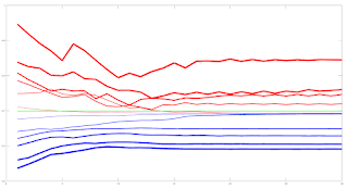
The blue lines show the average training error (y axis) and the red lines show the same average error metric on the held out cross validation data set for each tested model. The thickness of the lines represents the number of neurons in the single hidden layer of the NNs (the thicker the lines, the higher the number of hidden neurons). The horizontal green line shows the error of a generalized linear model (GLM) trained using iteratively reweighted least squares. It can be seen that NN models with 1 and 2 hidden neurons slightly outperform the GLM, with the 2 neuron model having the edge over the 1 neuron model. NN models with 3 or more hidden neurons over fit and underperform the GLM. The NN models were trained using Netlab's functions for Bayesian regularization over the parameters.

Looking at these results it would seem that a 2 neuron NN would be the best choice; however the error differences between the 1 and 2 neuron NNs and GLM are small enough to anticipate that the final classifications (with a basic greater/less than a 0.5 logistic threshold value for long/short) would perhaps be almost identical. 

Investigations into this will be the subject of my next post. 

The code box below gives the working Octave code for the above.

## load data
##training_data = dlmread( 'raw_netlab_training_features' ) ;
##cv_data = dlmread( 'raw_netlab_cv_features' ) ;
training_data = dlmread( 'netlab_training_features_svd' ) ;
cv_data = dlmread( 'netlab_cv_features_svd' ) ;
training_targets = dlmread( 'netlab_training_targets' ) ;
cv_targets = dlmread( 'netlab_cv_targets' ) ;

kk_loop_record = zeros( 30 , 7 ) ;

for kk = 1 : 30
  
## first train a glm model as a base comparison
input_dim = size( training_data , 2 ) ; ## Number of inputs.

net_lin = glm( input_dim , 1 , 'logistic' ) ; ## Create a generalized linear model structure.
options = foptions ; ## Sets default parameters for optimisation routines, for compatibility with MATLAB's foptions()
options(1) = 1 ;  ## change default value
##	OPTIONS(1) is set to 1 to display error values during training. If
##	OPTIONS(1) is set to 0, then only warning messages are displayed.  If
##	OPTIONS(1) is -1, then nothing is displayed.
options(14) = 5 ; ## change default value
##	OPTIONS(14) is the maximum number of iterations for the IRLS
##	algorithm;  default 100.
net_lin = glmtrain( net_lin , options , training_data , training_targets ) ;

## test on cv_data
glm_out = glmfwd( net_lin , cv_data ) ;
## cross-entrophy loss
glm_out_loss = -mean( cv_targets .* log( glm_out )  .+ ( 1 .- cv_targets ) .* log( 1 .- glm_out ) ) ;

kk_loop_record( kk , 7 ) = glm_out_loss ;

## now train an mlp
## Set up vector of options for the optimiser.
nouter = 30 ; ## Number of outer loops.
ninner = 2 ;	## Number of innter loops.
options = foptions ; ## Default options vector.
options( 1 ) = 1 ;	## This provides display of error values.
options( 2 ) = 1.0e-5 ; ## Absolute precision for weights.
options( 3 ) = 1.0e-5 ; ## Precision for objective function.
options( 14 ) = 100 ; ## Number of training cycles in inner loop.

training_learning_curve = zeros( nouter , 6 ) ; 
cv_learning_curve = zeros( nouter , 6 ) ;

for jj = 1 : 6

## Set up network parameters.
nin = size( training_data , 2 ) ; ## Number of inputs.
nhidden = jj ;	## Number of hidden units.
nout = 1 ; ## Number of outputs.
alpha = 0.01 ; ## Initial prior hyperparameter.
aw1 = 0.01 ;
ab1 = 0.01 ;
aw2 = 0.01 ;
ab2 = 0.01 ;

## Create and initialize network weight vector.
prior = mlpprior(nin , nhidden , nout , aw1 , ab1 , aw2 , ab2 ) ;
net = mlp( nin , nhidden , nout , 'logistic' , prior ) ;

## Train using scaled conjugate gradients, re-estimating alpha and beta.
for ii = 1 : nouter
  ## train net
  net = netopt( net , options , training_data , training_targets , 'scg' ) ;
  
  train_out = mlpfwd( net , training_data ) ;
  ## get train error
  ## mse
  ##training_learning_curve( ii ) = mean( ( training_targets .- train_out ).^2 ) ;
  
  ## cross entropy loss
  training_learning_curve( ii , jj ) = -mean( training_targets .* log( train_out )  .+ ( 1 .- training_targets ) .* log( 1 .- train_out ) ) ; 

  cv_out = mlpfwd( net , cv_data ) ;
  ## get cv error
  ## mse
  ##cv_learning_curve( ii ) = mean( ( cv_targets .- cv_out ).^2 ) ;
  
  ## cross entropy loss
  cv_learning_curve( ii , jj ) = -mean( cv_targets .* log( cv_out )  .+ ( 1 .- cv_targets ) .* log( 1 .- cv_out ) ) ; 
  
  ## now update hyperparameters based on evidence
  [ net , gamma ] = evidence( net , training_data , training_targets , ninner ) ;
  
##  fprintf( 1 , '\nRe-estimation cycle ##d:\n' , ii ) ;
##  disp( [ '  alpha = ' , num2str( net.alpha' ) ] ) ;
##  fprintf( 1 , '  gamma =  %8.5f\n\n' , gamma ) ;
##  disp(' ')
##  disp('Press any key to continue.')
  ##pause;
endfor ## ii loop

endfor ## jj loop

kk_loop_record( kk , 1 : 6 ) = cv_learning_curve( end , : ) ;

endfor ## kk loop

plot( training_learning_curve(:,1) , 'b' , 'linewidth' , 1 , cv_learning_curve(:,1) , 'r' , 'linewidth' , 1 , ...
training_learning_curve(:,2) , 'b' , 'linewidth' , 2 , cv_learning_curve(:,2) , 'r' , 'linewidth' , 2 , ...
training_learning_curve(:,3) , 'b' , 'linewidth' , 3 , cv_learning_curve(:,3) , 'r' , 'linewidth' , 3 , ...
training_learning_curve(:,4) , 'b' , 'linewidth' , 4 , cv_learning_curve(:,4) , 'r' , 'linewidth' , 4 , ...
training_learning_curve(:,5) , 'b' , 'linewidth' , 5 , cv_learning_curve(:,5) , 'r' , 'linewidth' , 5 , ...
training_learning_curve(:,6) , 'b' , 'linewidth' , 6 , cv_learning_curve(:,6) , 'r' , 'linewidth' , 6 , ...
ones( size( training_learning_curve , 1 ) , 1 ).*glm_out_loss , 'g' , 'linewidth', 2 ) ;

##  >> mean(kk_loop_record)
##  ans =
##
##     0.6928   0.6927   0.7261   0.7509   0.7821   0.8112   0.6990

##  >> std(kk_loop_record)
##  ans =
##
##     8.5241e-06   7.2869e-06   1.2999e-02   1.5285e-02   2.5769e-02   2.6844e-02   2.2584e-16

Friday, 25 March 2022

OrderBook and PositionBook Features

In my previous post I talked about how I planned to use constrained optimization to create features from Oanda's OrderBook and PositionBook data, which can be downloaded via their API. In addition to this I have also created a set of features based on the idea of Order Flow Imbalance (OFI), a nice exposition of which is given in this blog post along with a numerical example of how to calculate OFI. Of course Oanda's OrderBook/PositionBook data is not exactly the same as a conventional limit order book, but I thought they are similar enough to investigate using OFI on them. The result of these investigations is shown in the animated GIF below.

This shows the output from using the R Boruta package to check for the feature relevance of OFI levels to a depth of 20 of both the OrderBook and PositionBook to classify the sign of the log return of price over the periods detailed below following an OrderBook/PositionBook update (the granularity at which the OrderBook/PositionBook data can be updated is 20 minutes):

  • 20 minutes
  • 40 minutes
  • 60 minutes
  • the 20 minutes starting 20 minutes in the future
  • the 20 minutes starting 40 minutes in the future
for both the OrderBook and PositionBook, giving a total of 10 separate images/results in the above GIF.
 
Observant readers may notice that in the GIF there are 42 features being checked, but only an OFI depth of 20. The reason for this is that the data contain information about buys/sell orders and long/short positions both above and below the current price, so what I did was calculate OFI for:
  • buy orders above price vs sell orders below price
  • sell orders above price vs buy orders below price
  • long positions above price vs short positions below price
  • short positions above price vs long positions below price 
As can be seen, almost all features are deemed to be relevant with the exception of 3 OFI levels rejected (red candles) and 2 deemed tentative (yellow candles).

It is my intention to use these features in a machine learning model to classify the probability of future market direction over the time frames mentioned above. 

More in due course.

Tuesday, 15 February 2022

A Possible, New Positionbook Indicator?

In my previous post I ended with saying that I would post about some sort of "sentiment indicator" if, and only if, I had something positive to say about my progress on this work. This post is the first on this subject.

The indicator I'm working on is based on the open position ratios data that is available via the Oanda api. For the uninitiated, this data gives the percentage of traders holding long and short positions, and at what price levels, in 14 selected forex pairs and also gold and silver. The data is updated every 20 minutes. I have long felt that there must be some value hidden in this data but the problem is how to extract it.

What I've done is take the percentage values from the (usually) hundreds of separate price levels and sum and normalise them over three defined ranges - levels above/below the high/low of each 20 minute period and the level(s) that span the price range of this period. This is done separately for long and short positions to give a total of 6 percentage figures that sum to 100%. Conceptually, this can be thought of as attaching to the open and close of a 20 minute OHLC bar the 6 percentage position values that were in force at the open and close respectively. The problem is to try and infer the actual, net changes in positions that have taken place over the time period this 20 minute bar was forming. In this way I am trying, if you like, to create a sort of  "skin in the game" indicator as opposed to an indicator derived from order book data, which could be said to be based on traders' current (changeable) intentions as expressed by their open orders and which are subject to shenanigans such as spoofing.

The methodology I've decided on to realise the above is constrained optimization using Octave's fmincon function. The objective function is simply:

    denom = X' * old_pb_net_pos ;
    J = mean( ( new_pb_net_pos .- ( ( X .* old_pb_net_pos ) ./ denom ) ).^2 ) ;

for a multiplicative position value change model where:

  • X is a vector of constants that are to be optimised
  • old_pb_net_pos is a vector of the 6 percentage values at the open
  • new_pb_net_pos is a vector of the 6 percentage values at the close

This is a constrained model because percentage position values at price levels outside the bar range cannot actually increase as a result of trades that take place within the bar range, so the X values for these levels are necessarily constrained to a maximum value of 1 (implying no real, absolute change at these levels). Similarly, all X values must be greater than zero (a zero value would imply a mass exit of all positions at this level, which never actually happens).

The net result of the above is an optimised X vector consisting of multiplicative constants that are multiplied with old_pb_net_pos to achieve new_pb_net_pos according to the logic exemplified in the above objective function. It is these optimised X values from which the underlying, real changes in positions will be inferred and features created. More on this in my next post.


Tuesday, 4 January 2022

Matrix Profile and Weakly Labelled Data - 2nd and Final Update

It has been over three months since my last post, which was intended to be the first in a series of posts on the subject of the title of this post. However, it turned out that the results of my work were underwhelming and so I decided to stop flogging a dead horse and move onto other things. I still have some ideas for using Matrix Profile, but not for the above. These ideas may be the subject of a future blog post.

I subsequently looked at plotting order levels using the data that is available via the Oanda API and I have come up with Octave code to render plots such as this:

where the brighter yellow stripes show ranges where there is an accumulation of sell/buy orders above/below price. These can be interpreted as support/resistance areas. It is normally my practice to post my Octave code, but the code for this plot is quite idiosyncratic and depends very much on the way I have chosen to store the underlying data downloaded from Oanda. As such, I don't think it would be helpful to readers and so I am not posting the code. That said, if there is actually a demand I am more than happy to make it available in a future blog post.

Having done this, it seemed natural to extend it to Open Position Ratios which are also available via the Oanda API. Plotting these levels renders plots that are similar to the plot shown above, but show levels where open long/short positions instead of open orders are accumulated. Although such plots are visually informative, I prefer something more objective, and so for the last few weeks I have been working on using the open position ratios data to construct some sort of sentiment indicator that hopefully could give a heads up to future price movement direction. This is still very much a work in progress which I shall post about if there are noteworthy results.

More in due course.

Friday, 17 September 2021

Matrix Profile and Weakly Labelled Data - Update 1

This is the first post in a short series detailing my recent work following on from my previous post. This post will be about some problems I have had and how I partially solved them.

The main problem was simply the speed at which the code (available from the companion website) seems to run. The first stage Matrix Profile code runs in a few seconds, the second, individual evaluation stage in no more than a few minutes, but the third stage, greedy search, which uses Golden Section Search over the pattern candidates, can take many, many hours. My approach to this was simply to optimise the code to the best of my ability. My optimisations, all in the compute_f_meas.m function, are shown in the following code boxes. This while loop

i = 1;
while true
    
 if i >= length(anno_st)
    break;
 endif
       
first_part = anno_st(1:i);
second_part = anno_st(i+1:end);
bad_st = abs(second_part - anno_st(i)) < sub_len;
second_part = second_part(~bad_st);
anno_st = [first_part; second_part;];
i = i + 1;
      
endwhile
is replaced by this .oct compiled version of the same while loop
#include 
#include 

DEFUN_DLD ( stds_f_meas_while_loop_replace, args, nargout,
"-*- texinfo -*-\n\
@deftypefn {Function File} {} stds_f_meas_while_loop_replace (@var{input_vector,sublen})\n\
This function takes an input vector and a scalar sublen\n\
length. The function sets to zero those elements in the\n\
input vector that are closer to the preceeding value than\n\
sublen. This function replaces a time consuming .m while loop\n\
in the stds compute_f_meas.m function.\n\
@end deftypefn" )

{
octave_value_list retval_list ;
int nargin = args.length () ;

// check the input arguments
if ( nargin != 2 ) // there must be a vector and a scalar sublen
   {
   error ("Invalid arguments. Inputs are a column vector and a scalar value sublen.") ;
   return retval_list ;
   }

if ( args(0).length () < 2 )
   {
   error ("Invalid 1st argument length. Input is a column vector of length > 1.") ;
   return retval_list ;
   }
   
if ( args(1).length () > 1 )
   {
   error ("Invalid 2nd argument length. Input is a scalar value for sublen.") ;
   return retval_list ;
   }
// end of input checking  
  
ColumnVector input = args(0).column_vector_value () ;
double sublen = args(1).double_value () ;
double last_iter ;

// initialise last_iter value
last_iter = input( 0 ) ;
     
for ( octave_idx_type ii ( 1 ) ; ii < args(0).length () ; ii++ )
    {
    
      if ( input( ii ) - last_iter >= sublen )
      {
        last_iter = input( ii ) ;
      }
      else
      {
        input( ii ) = 0.0 ;
      }
      
    } // end for loop
   
retval_list( 0 ) = input ;

return retval_list ;

} // end of function
and called thus
anno_st = stds_f_meas_while_loop_replace( anno_st , sub_len ) ;
anno_st( anno_st == 0 ) = [] ;
This for loop
is_tp = false(length(anno_st), 1);
for i = 1:length(anno_st)
    if anno_ed(i) > length(label)
        anno_ed(i) = length(label);
    end
    if sum(label(anno_st(i):anno_ed(i))) > 0.8*sub_len
        is_tp(i) = true;
    end
end
tp_pre = sum(is_tp);
is replaced by use of cellslices.m and cellfun.m thus
label_length = length( label ) ;
anno_ed( anno_ed > label_length ) = label_length ;
cell_slices = cellslices( label , anno_st , anno_ed ) ;
cell_sums = cellfun( @sum , cell_slices ) ;
tp_pre = sum( cell_sums > 0.8 * sub_len ) ;
and a further for loop
is_tp = false(length(pos_st), 1);
for i = 1:length(pos_st)
    if sum(anno(pos_st(i):pos_ed(i))) > 0.8*sub_len
        is_tp(i) = true;
    end
end
tp_rec = sum(is_tp);
is replaced by
cell_slices = cellslices( anno , pos_st , pos_ed ) ;
cell_sums = cellfun( @sum , cell_slices ) ;
tp_rec = sum( cell_sums > 0.8 * sub_len ) ;

Although the above measurably improves running times, overall the code of the third stage is still sluggish. I have found that the best way to deal with this, on the advice of the original paper's author, is to limit the number of patterns to search for, the "pat_max" variable, to the minimum possible to achieve a satisfactory result. What I mean by this is that if  pat_max = 5 and the result returned also has 5 identified patterns, incrementally increase pat_max until such time that the number of identified patterns is less than pat_max. This does, by necessity, mean running the whole routine a few times, but it is still quicker this way than drastically over estimating pat_max, i.e. choosing a value of say 50 to finally identify maybe only 5/6 patterns.

More in due course.

Friday, 27 August 2021

Another Iterative Improvement of my Volume/Market Profile Charts

Below is a screenshot of this new chart version, of today's (Friday's) price action at a 10 minute bar scale:

Just by looking at the chart it might not be obvious to readers what has changed, so the changes are detailed below.

The first change is in how the volume profile (the horizontal histogram on the left) is calculated. The "old" version of the chart calculates the profile by assuming the "model" that tick volume for each 10 minute bar is normally distributed across the high/low range of the bar, and then the profile histogram is the accumulation of these individual, 10 minute, normally distributed "mini profiles." A more complete description of this is given in my Market Profile Chart in Octave blog post, with code.

The new approach is more data centric rather than model based. Every 10 minutes, instead of downloading the 10 minute OHLC and tick volume, the last 10 minutes worth of 5 second OHLC and tick volume is downloaded. The whole tick volume of each 5 second period is assigned to a price level equivalent to the Typical price (rounded to the nearest pip) of said 5 second period, and the volume profile is then the accumulation of these volume ticks per price level. I think this is a much more accurate reflection of the price levels at which tick volume actually occurred compared to the old, model based charts. This second screenshot is of the old chart over the exact same price data as the first, improved version of the chart.

It can be seen that the two volume profile histograms of the respective charts differ from each other in terms of their overall shape and the number and price levels of peaks (Points of Control) and troughs (Low Volume Nodes).

The second change in the new chart is in how the background heatmap is plotted. The heatmap is a different presentation of the volume profile whereby higher volume price levels are shown by the brighter yellow colours. The old chart only displays the heatmap associated with the latest calculated volume profile histogram, which is projected back in time. This is, of course, a form of lookahead bias when plotting past prices over the latest heatmap. The new chart solves this by plotting a "rolling" version of the heatmap which reflects the volume profile that was in force at the time each 10 minute OHLC candle formed. It is easy to see how the Points of Control and Low Volume Nodes price levels ebb and flow throughout the trading day.

The third change, which naturally followed on from the downloading of 5 second data, is in the plotting of the candlesticks. Rather than having a normal, open to close candlestick body, the candlesticks show the "mini volume profiles" of the tick volume within each bar, plotted via Octave's patch function. The white candlestick wicks indicate the usual high/low range, and the open and close levels are shown by grey and black dots respectively. This is more clearly seen in the zoomed in screenshot below.

I wanted to plot these types of bars because recently I have watched some trading webcasts, which talked about "P", "b" and "D" shaped bar profiles at "areas of interest." The upshot of these webcasts is that, in general, a "P" bar is bullish, a "b" is bearish and a "D" is "in balance" when they intersect an "area of interest" such as Point of Control, Low Volume Node, support and resistance etc. This is supposed to be indicative of future price direction over the immediate short term. With this new version of chart, I shall be in a position to investigate these claims for myself.