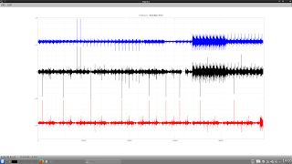
The chart itself is a plot of log returns of various forex crosses and Gold and Silver log returns, concatenated into one long vector. The black is the actual return of the underlying, the blue is the return of the base currency and the red is the cross currency, both of these being calculated from indices formed from the currency strength indicator.
By looking at the dates these spikes occur and then checking online I have flagged four historical "Black swan" events that occured within the time frame the data covers, which are listed in chronological order below:
- Precious metals price collapse in mid April 2013
- Swiss Franc coming off its peg to the Euro in January 2015
- Fears over the Hong Kong dollar and Renminbi currency peg in January 2016
- Brexit black Friday
It can be seen that the final chart shows much more homogeneous data within each concatenated series, which should have benefits when said data is used as machine learning input. Also, the data that has been deleted will provide a useful, extreme test set to stress test any finished model. More in due course.


No comments:
Post a Comment